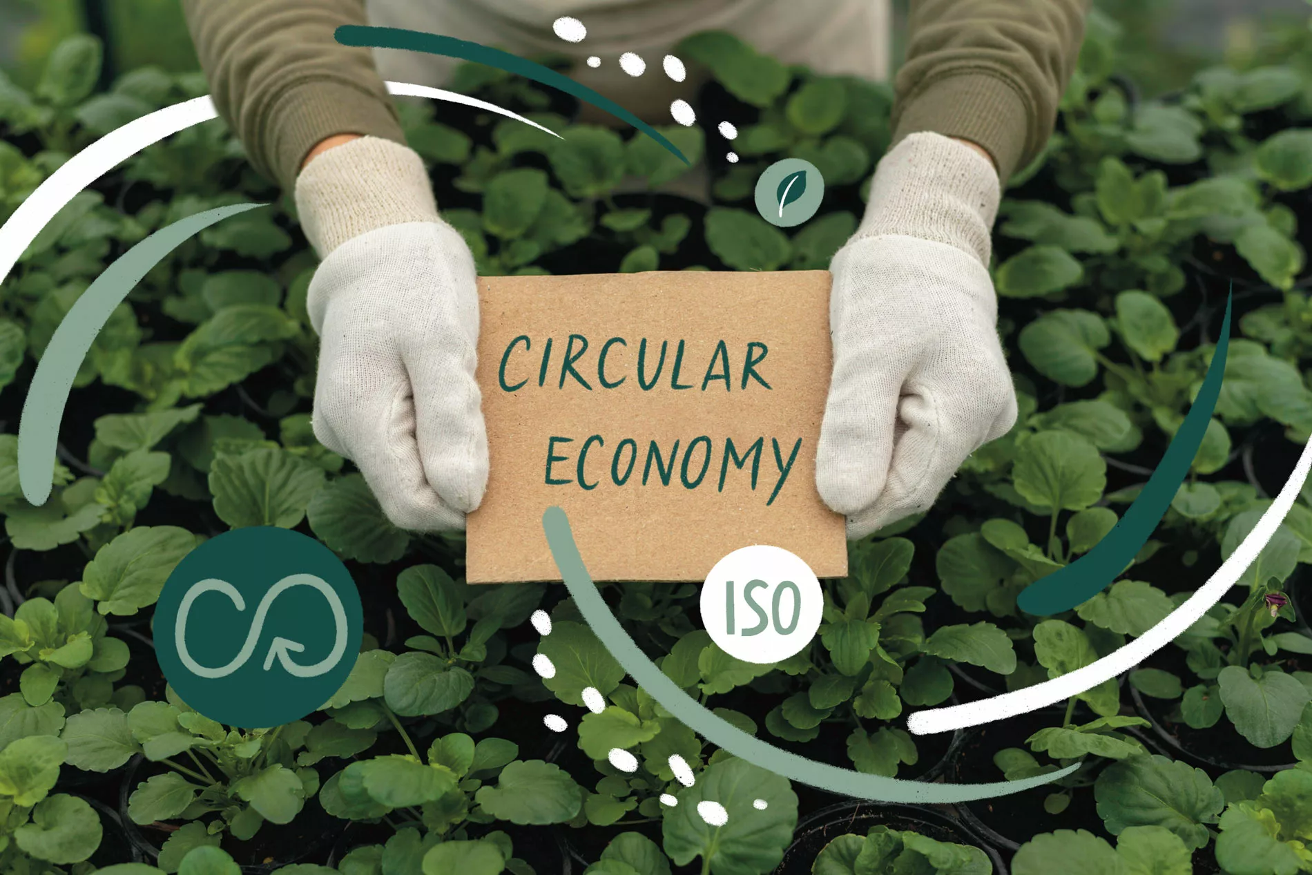
Reduce, Reuse, Recycle
“Sustainability cannot be imposed, but it can become the goal of a deliberately chosen path.
For this reason, we address companies with a kind message, urging them to abandon the idea of waste and safeguard the beauty of the world in which we live.”
HENRY & CO.
Reduce, Reuse, Recycle
“Sustainability cannot be imposed, but it can become the goal of a deliberately chosen path. For this reason, we address companies with a kind message, urging them to abandon the idea of waste and safeguard the beauty of the world in which we live.”
Please, Reduce, Reuse, Recycle.”
by HENRY & CO.
HENRY & CO. is a ecodesign, sustainability, and communication agency that works with the belief that the only possible future is sustainable.

What are the key advantages of a sustainable business?
- Increased brand reputation: A sustainable business can significantly improve public perception and brand reputation.
- Greater access to funds and financing: businesses that demonstrate a commitment to sustainability can benefit from increased financing opportunities, dedicated European funds, or ESG-focused investors.
- Future-proofing and resilience: sustainable businesses are well-positioned to face future challenges, including regulatory changes, environmental risks, and evolving consumer expectations.
Clients who chose us:


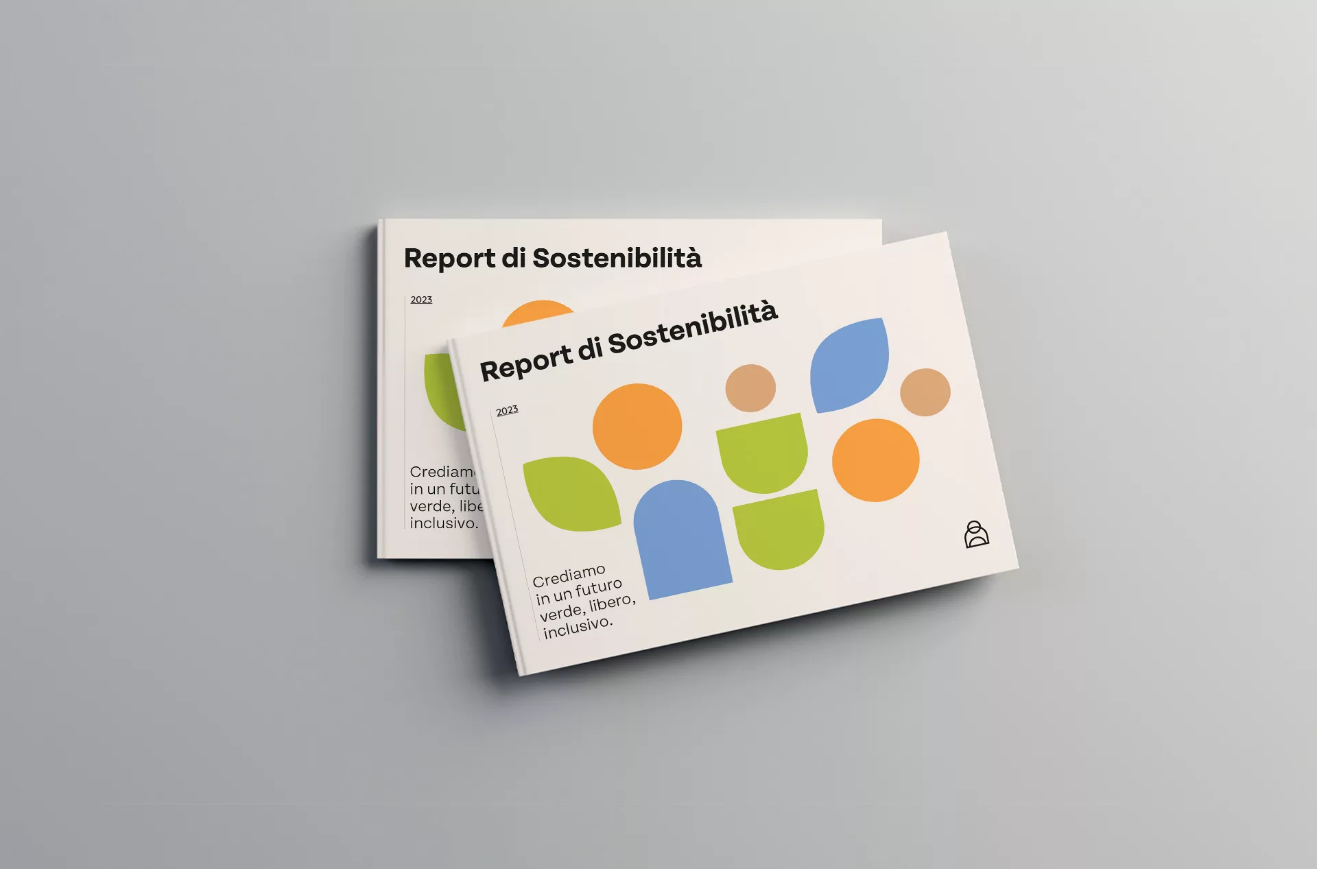
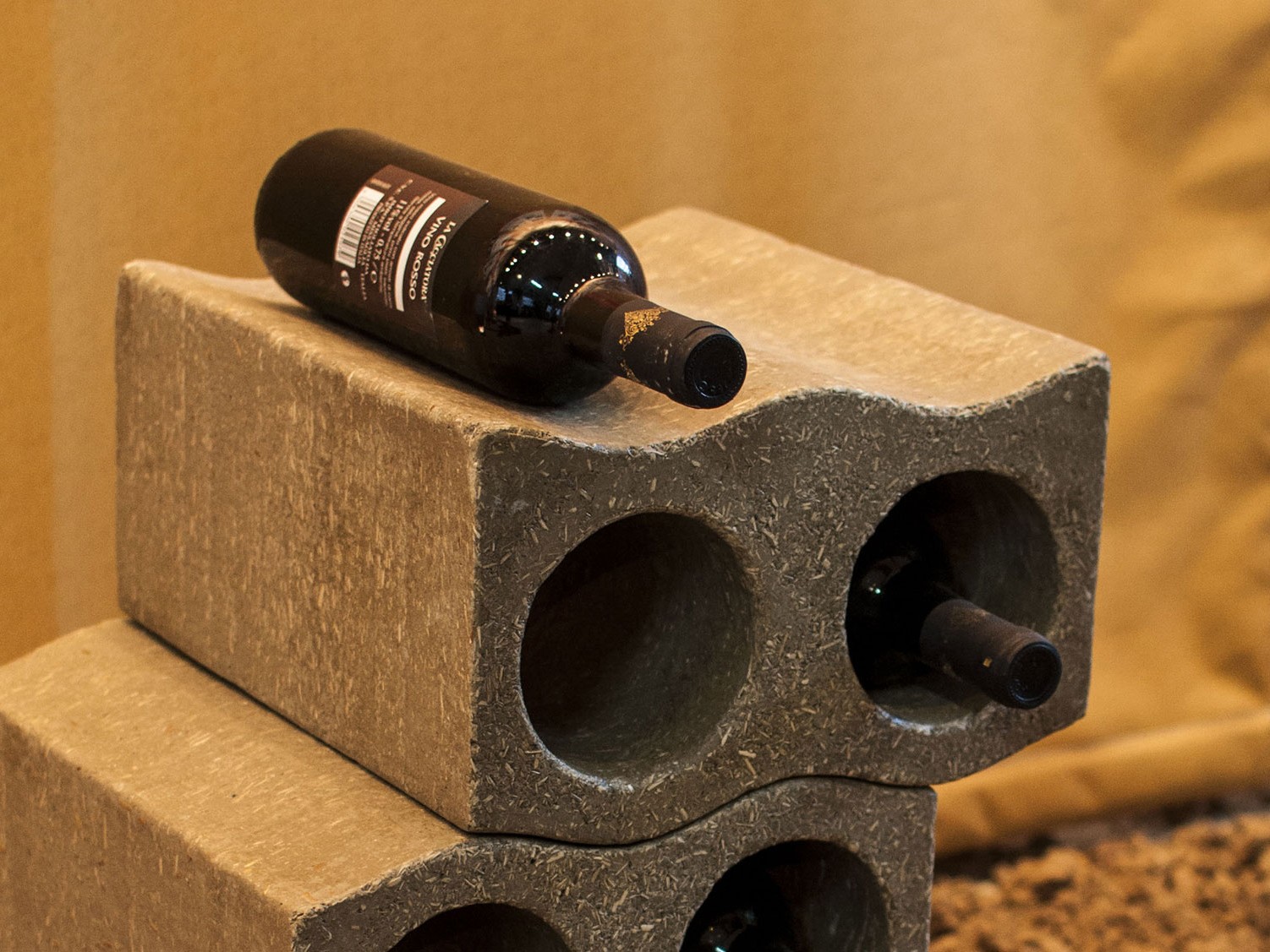
Portfolio
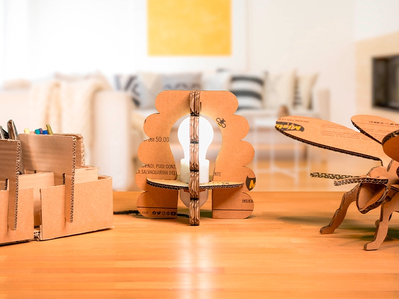
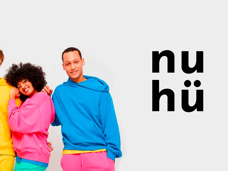
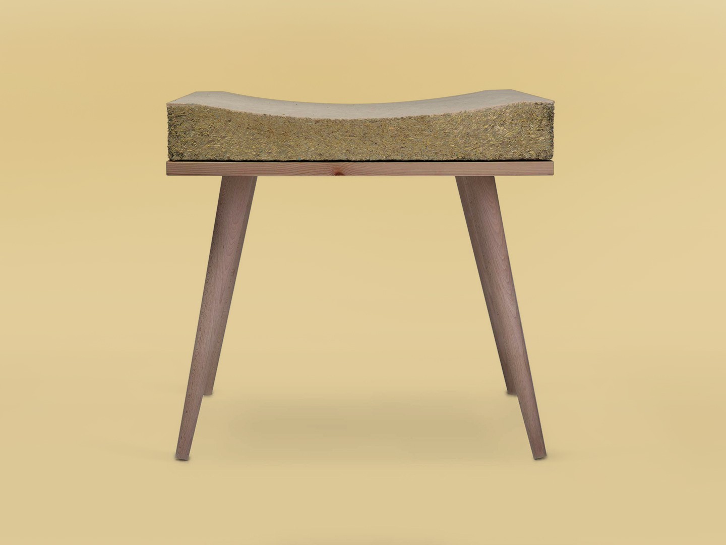
Projects of reduction, reuse, and recycling
The 7 pillars of sustainable services offered by HENRY & CO:
- Our approach to sustainable design is based on Circular Design Thinking.
- We incorporate circular economy principles in our projects, focusing on sharing, leasing, reuse, repair, refurbishment, and recycling of materials.
- We adopt ecodesign principles in our design methodology for optimal sustainability.
- We design sustainable packaging with low environmental impact for a greener future.
- We are at the forefront of research and use of innovative and sustainable materials for design.
- We use Life Cycle Analysis (LCA) to measure the environmental impact of our design projects.
- Through Green Marketing, we emphasize our commitment to sustainability and corporate social responsibility.


Circular Design Thinking:
strategic and regenerative design for sustainable innovation
The method in 4 steps:
- Understand – Know the user and the system.
- Define – Articulate the design challenge.
- Do – Ideate, design, and prototype as many iterations and versions as possible.
- Launch – Launch your project and build a compelling narrative.
Courses held at: