HENRY & CO. for HIKARI: new light to light
Reduction | Branding | Marketing & Communication
Challenge
Designing brand identity and website for the custom LED lighting brand HIKARI.
Result
Special project for reusing shipping packaging and social video campaign for the launch and promotion of the gift boxes.
Client
HIKARI
SDGs
HIKARI is a Verona-based company pioneering the application of LED technology in the mobile, curtain, refrigeration counter, hood, and general linear lighting sectors.
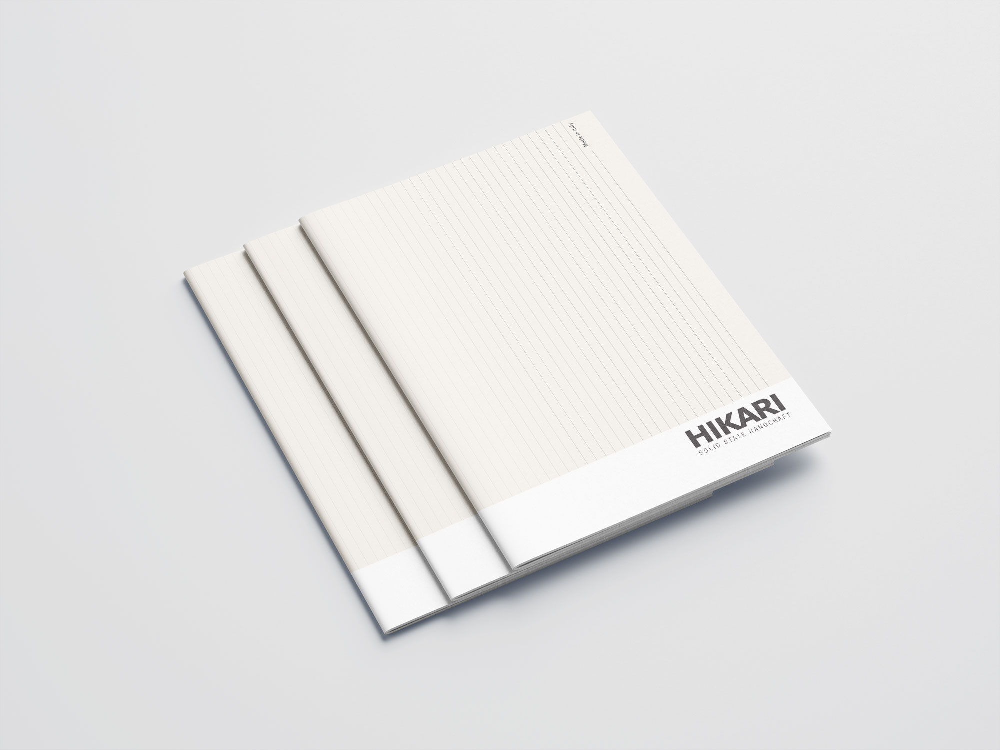
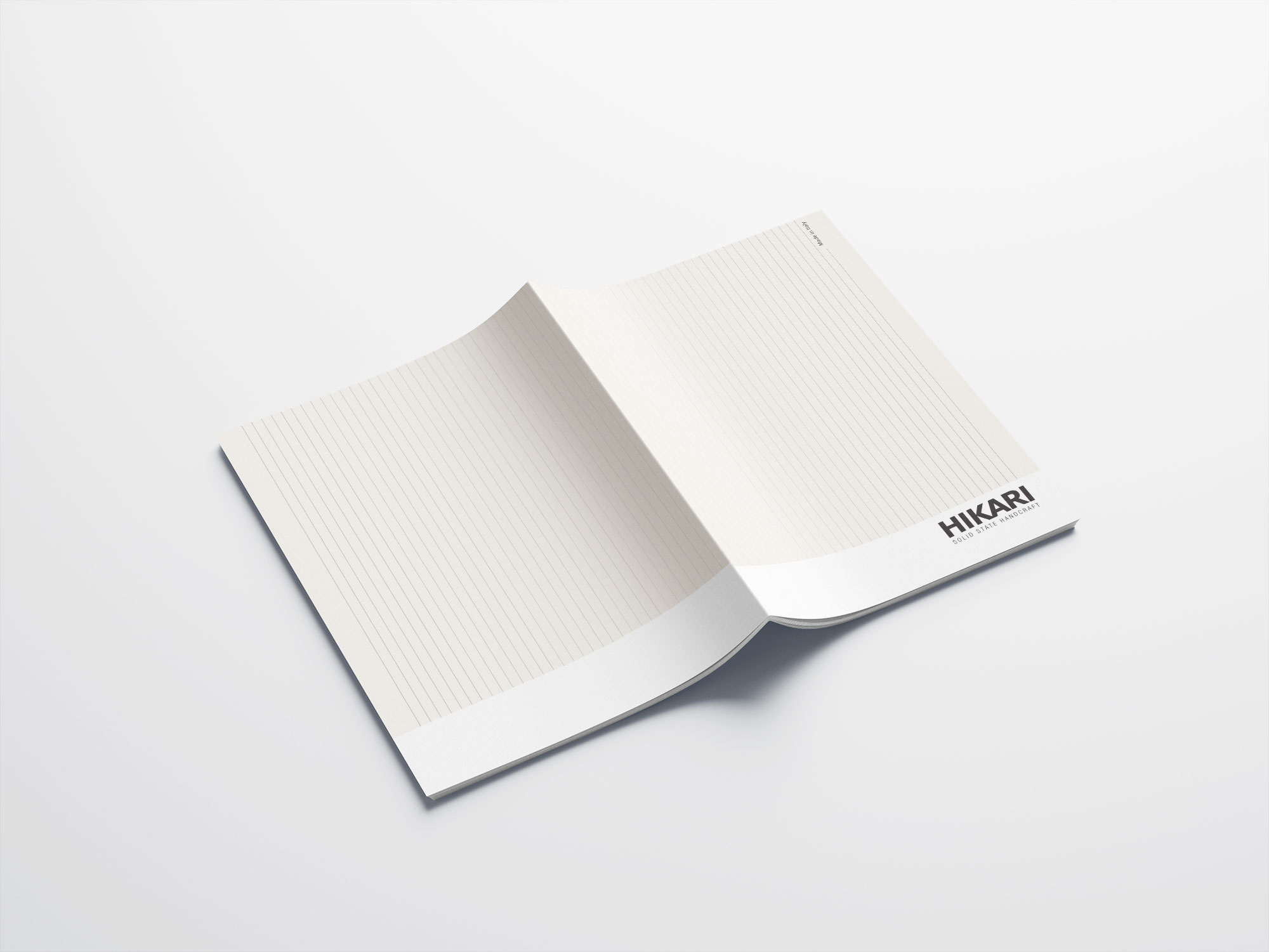
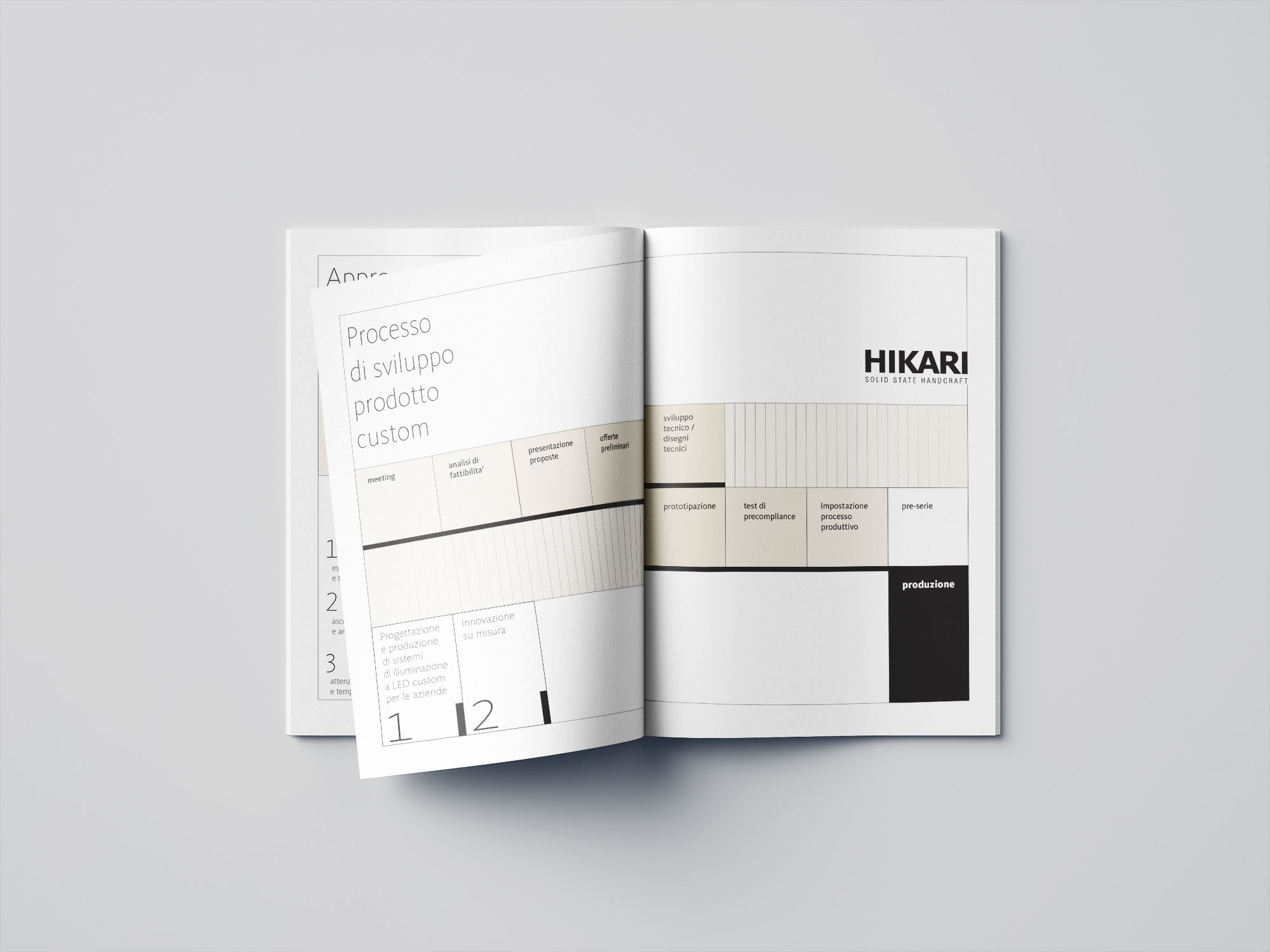
Thanks to their extensive know-how in linear lighting solutions, the company’s brand identity could only take inspiration from the key element of the line.
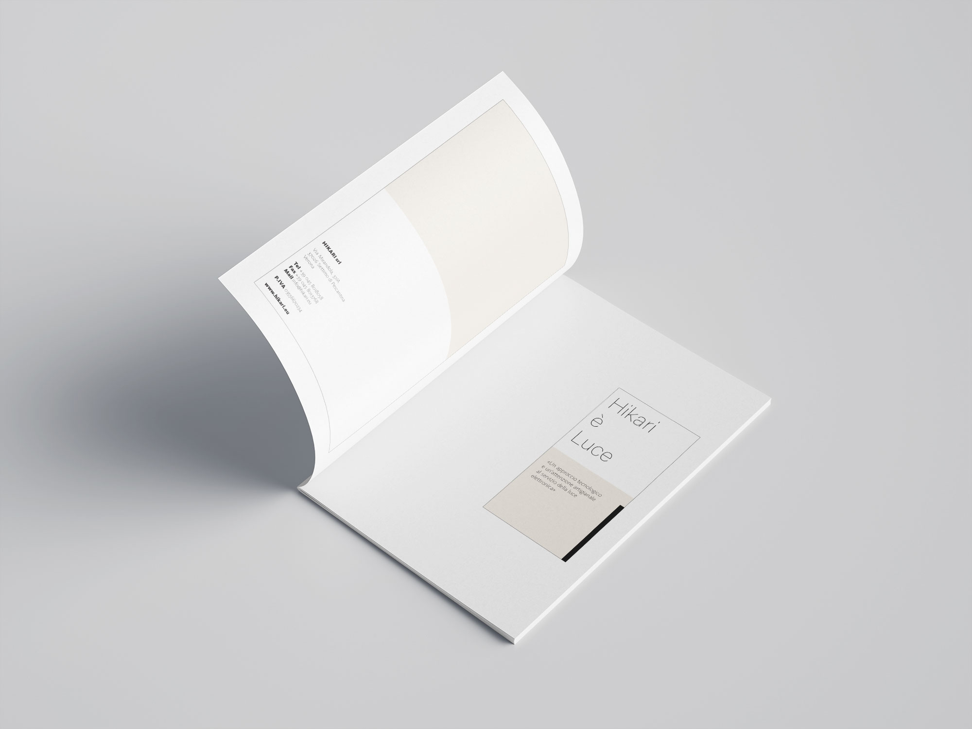
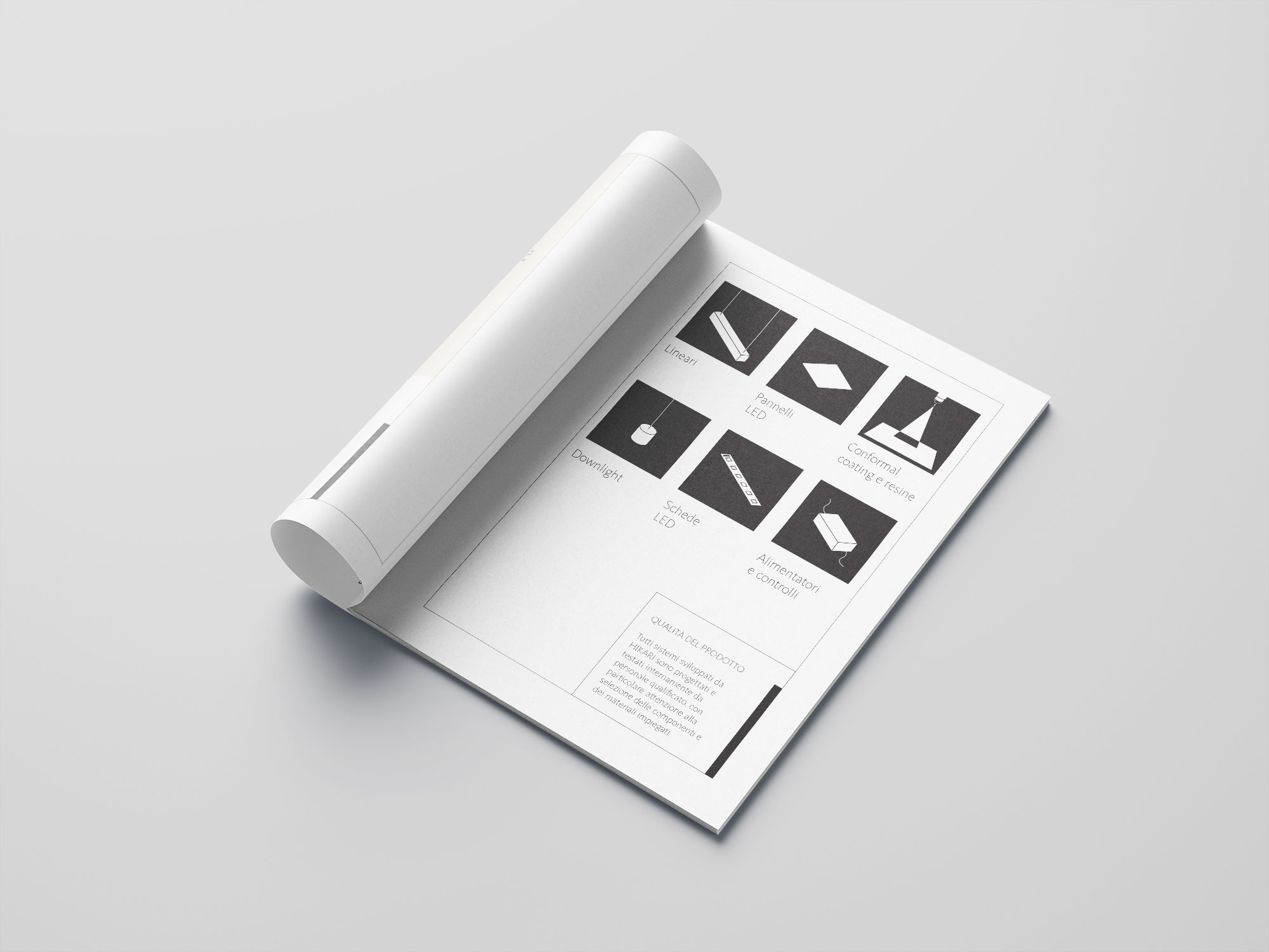
This simple geometry, combined with the Eastern minimalism evoked by the name, Hikari, gave a clear stylistic direction to the HENRY & CO. team, who developed the brand identity and communication materials by manipulating the line in a play of thicknesses and subtleties, of solids and voids.
The profile thus becomes distinctive and characteristic, in perfect harmony with the brand’s offering.
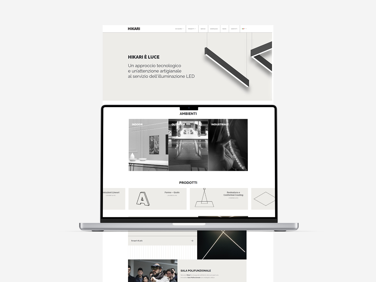
Based on the brand identity, the website translated the same lines into a straightforward and cohesive browsing experience, characterized by a clean, intuitive interface and highly accessible design. Every product is iconized and simplified, universally recognizable and understandable.
