Challenge
Redesign the brand identity, packaging, and retail design of Aroma Pastry with a sustainable approach.
Result
Starting from the project brief, HENRY & CO. developed a new coordinated image for Aroma Pastry, translating stylistic and sustainability elements into the brand, packaging, and retail design of the shop, highlighting the sophistication and authenticity of one of the most appreciated pastry shops in the province of Verona.
Client
Aroma Pastry
SDGs
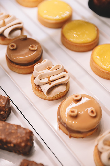
Aroma is a well-known pastry shop in the province of Verona with more than 20,000 followers on Facebook and boasts a 4-star rating out of 5 from over 700 reviews. Over the years, Aroma has been able to innovate the landscape of Verona pastries with an American approach, focusing on extreme customization and creative presentation of sweets.
Aroma decided to rely on HENRY & CO. to rethink its image with a new philosophy of sustainability: from the brand identity to packaging to retail design, HENRY & CO. redesigned every customer touchpoint to convey all of Aroma’s passion and style with a particular focus on sustainability.
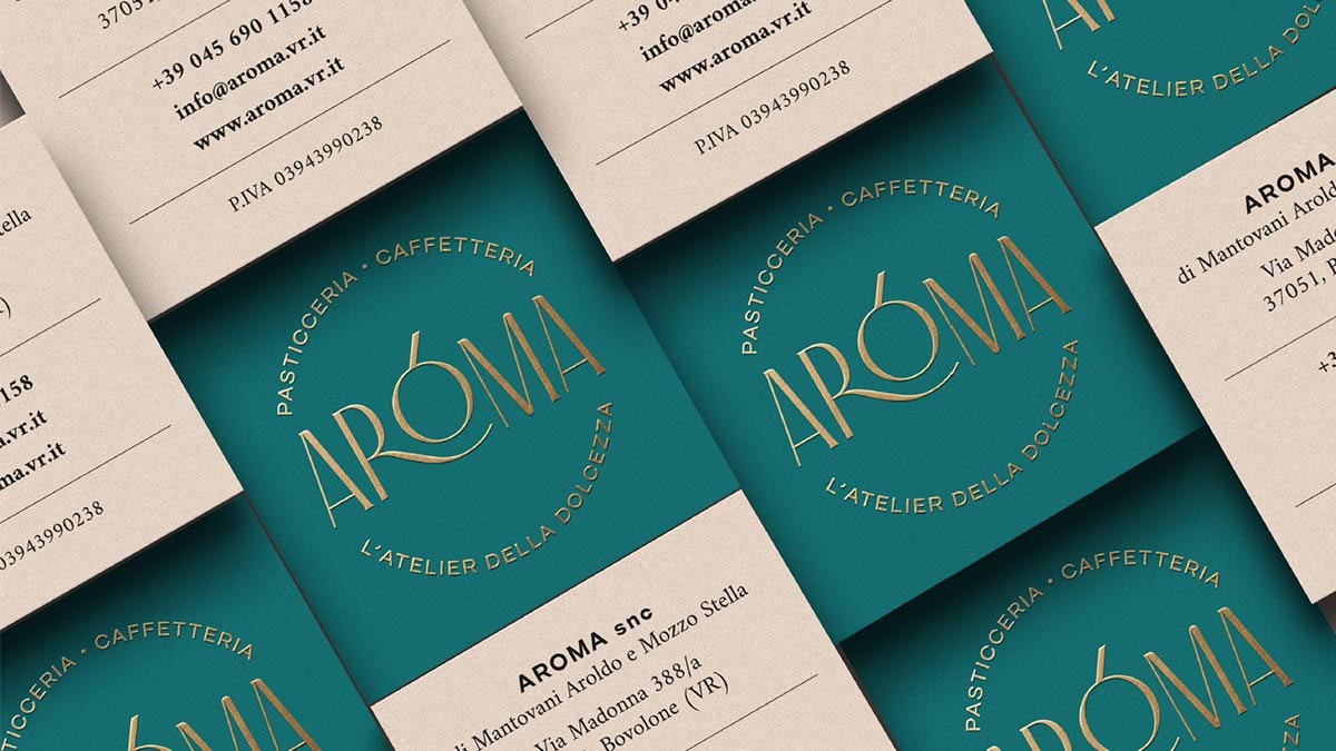
The development of the new brand identity first focused on the logo and payoff: after several research and analysis on the ambitions, desires, and characteristics of the pastry shop, HENRY & CO. developed a brand identity capable of fully summarizing and representing Aroma’s refined, original, and sophisticated identity.
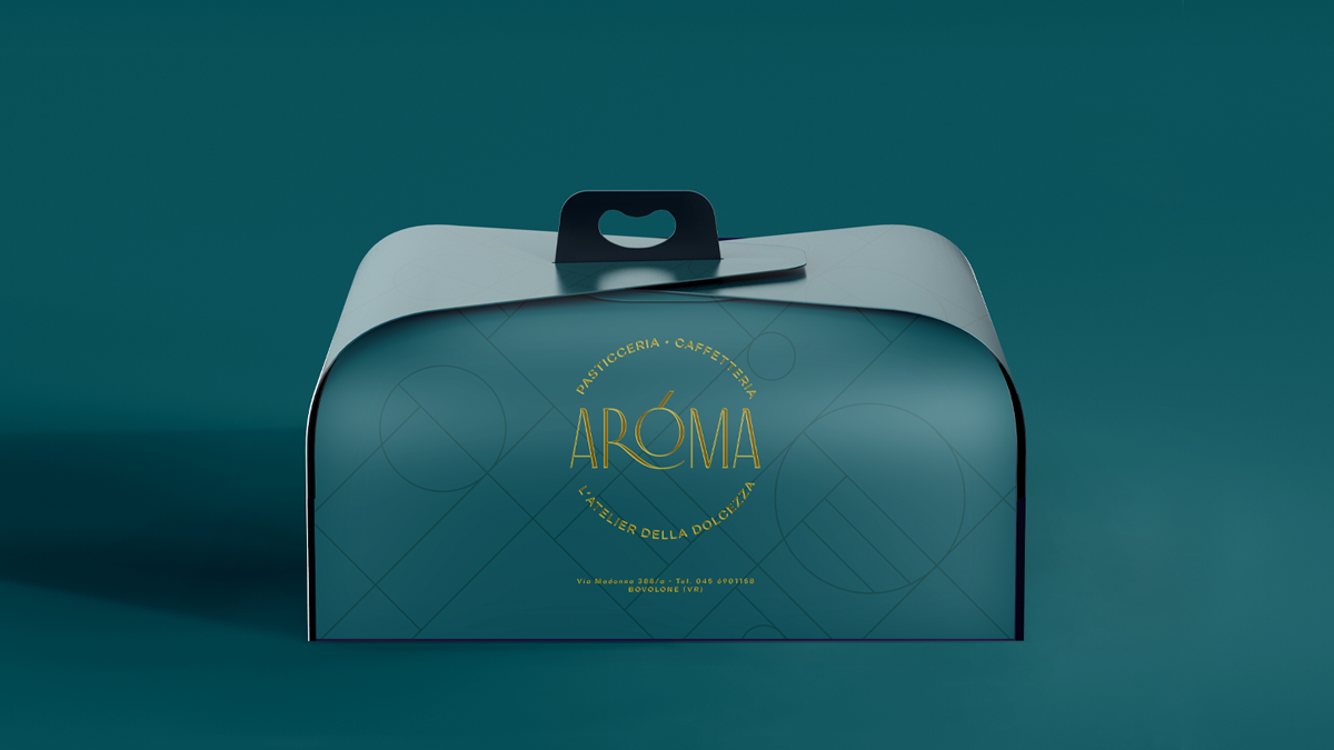
Thin and sinuous lines unravel into a highly visible and impactful logotype. The “R” surrounds the “O” in a gentle and refined embrace, rich in style and elegance. The payoff “L’atelier of sweetness” fully summarizes the refined and distinguished imagery of the brand and, together with the simpler and more objective description, frames the logotype to simulate a stamp, a mark of absolute quality and excellence that further enhances Aroma and its offering. The sustainable intervention materialized in a design study to reduce as much ink used in printing as possible while maintaining high impact and visibility.
Starting from the new logo, the development continued with the packaging: using the color determined in the brand identity development, the design work focused on the study of a texture capable of strongly distinguishing the packaging while reducing as much as possible the need for special processes required for its production and characterization. The result is a web of thin irregular geometries that surround and complete the logo, giving it place and context over a monochrome surface. The packaging was also developed using FSC paper.
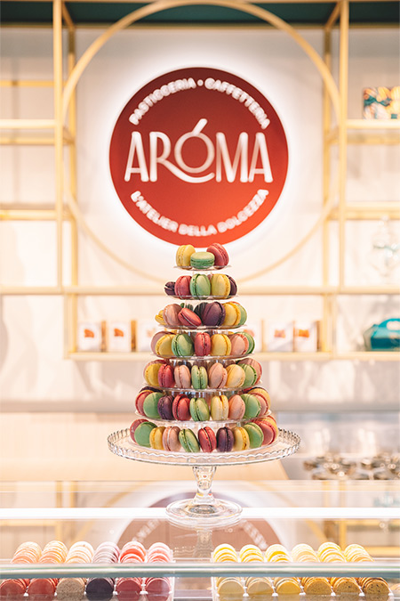
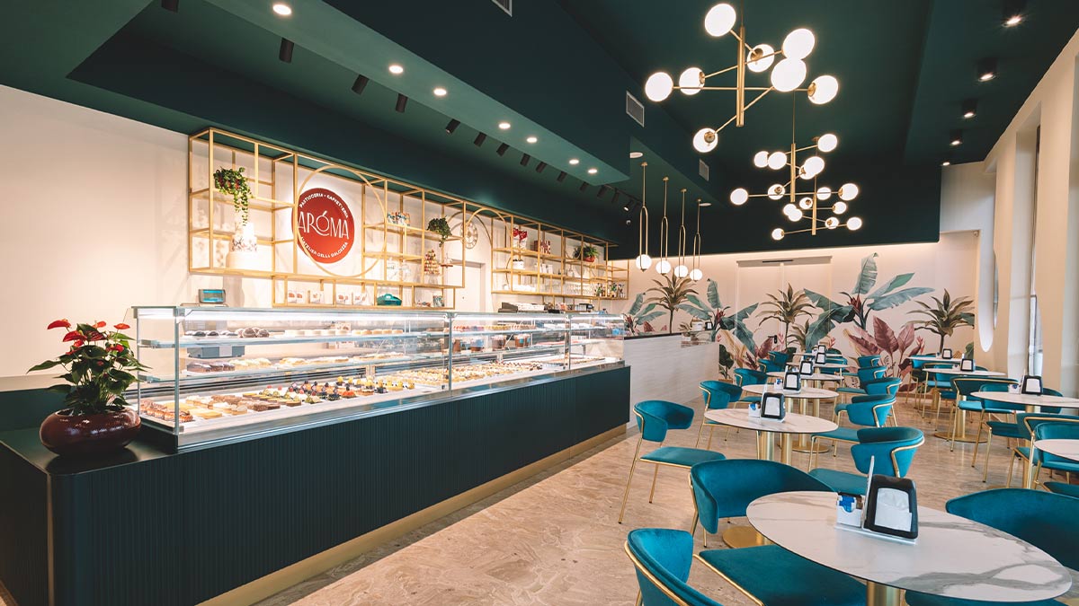
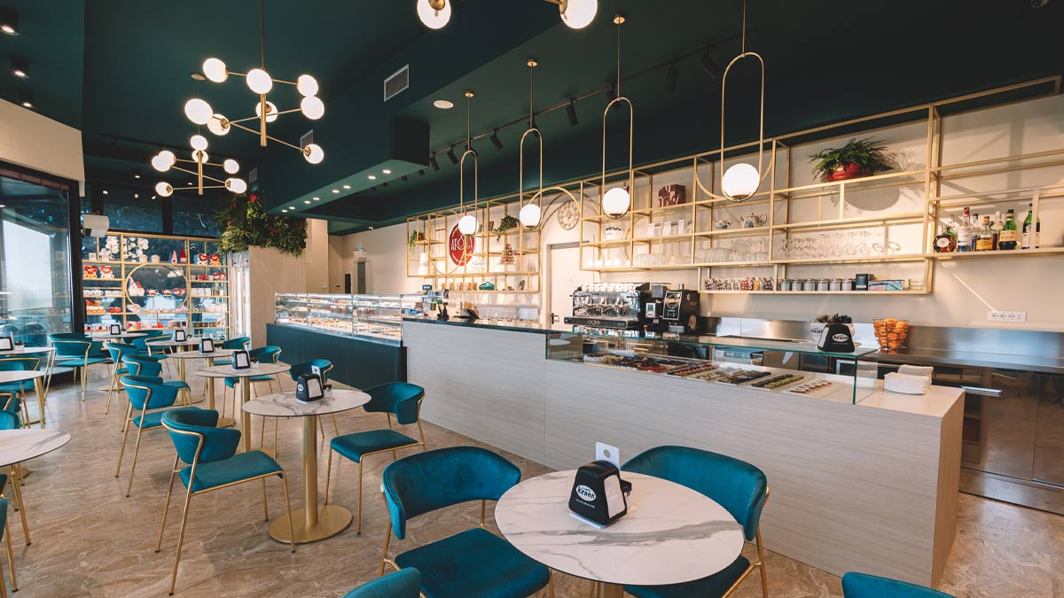
The effectiveness of the work done on the packaging strongly inspired the shop’s redesign. The dense geometric pattern that characterized the packaging design was translated into the main elements defining the shop: metal structures echo the geometric texture turning it into functional shelves and distinctive aesthetic elements.
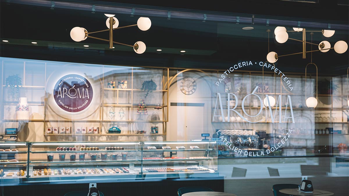
The same texture was later used on the window graphics, providing protection to the people and products inside from external radiation, thus improving internal comfort. The shop’s counter was redesigned to better distinguish the different display areas, and the lighting was redesigned to highlight the assortment of pastries and sweets. Similarly, the ceiling was tinted to alter the perception of the shop’s size and focus attention on the counter area, promoting a sense of intimacy and secrecy typical of a boutique. The color palette chosen for the redesign aims to promote a feeling of warmth, intimacy, and naturalness, further accentuated by the variegated tropical wallpaper.
The furniture created was designed respecting the principles of modularity to allow future reuse and repositioning of the same elements. In addition, materials from responsibly managed supply chains were selected, such as wood, paper, and metal, reusing materials previously employed wherever possible to optimize the use of new raw materials.
