Cafedesart: luxury furniture embarks on a sustainable growth journey
Reduction | Design | Branding | Green economy | Marketing & communication
Challenge
Accompanying the company on a 360-degree sustainability journey.
Result
Short and long-term strategy, artistic direction, implementation of marketing, communication, visual and product design tools.
Client
Cafedesart
SDGs
Cafedesart is a deco and contemporary furniture brand of F.lli Bianchini, a historic cabinetmaking company in the Veronese furniture district with over 50 years of history. The company contacted HENRY & CO. to embark on a 360-degree sustainability journey that would touch and transform short- and long-term strategy, artistic direction, marketing, communication, and design to promote and communicate sustainable luxury.
The collaboration began with the team at HENRY & CO. studying the evolution of deco style over the decades. This research provided an updated understanding of evolving tastes and trends in the furniture world, as well as analyzing the evolution of the concept of luxury in recent years.
The research laid the groundwork for further market analysis, which involved a detailed study of competitors and their positioning. Based on these findings, a first draft of the strategic direction was outlined.
Based on the findings, the work focused on the company itself: using Circular Design Thinking tools, the company was able to clarify its values and express its goals. In a summary act, the outcomes from the sessions were distilled into four concepts, four pillars, from which every decision, communication, and direction would be made.
Light
Content
Honest
Shared
With values, strategic direction, and commercial direction identified, HENRY & CO.’s work focused on introducing a new design concept linked to eco-design dynamics and optimization.
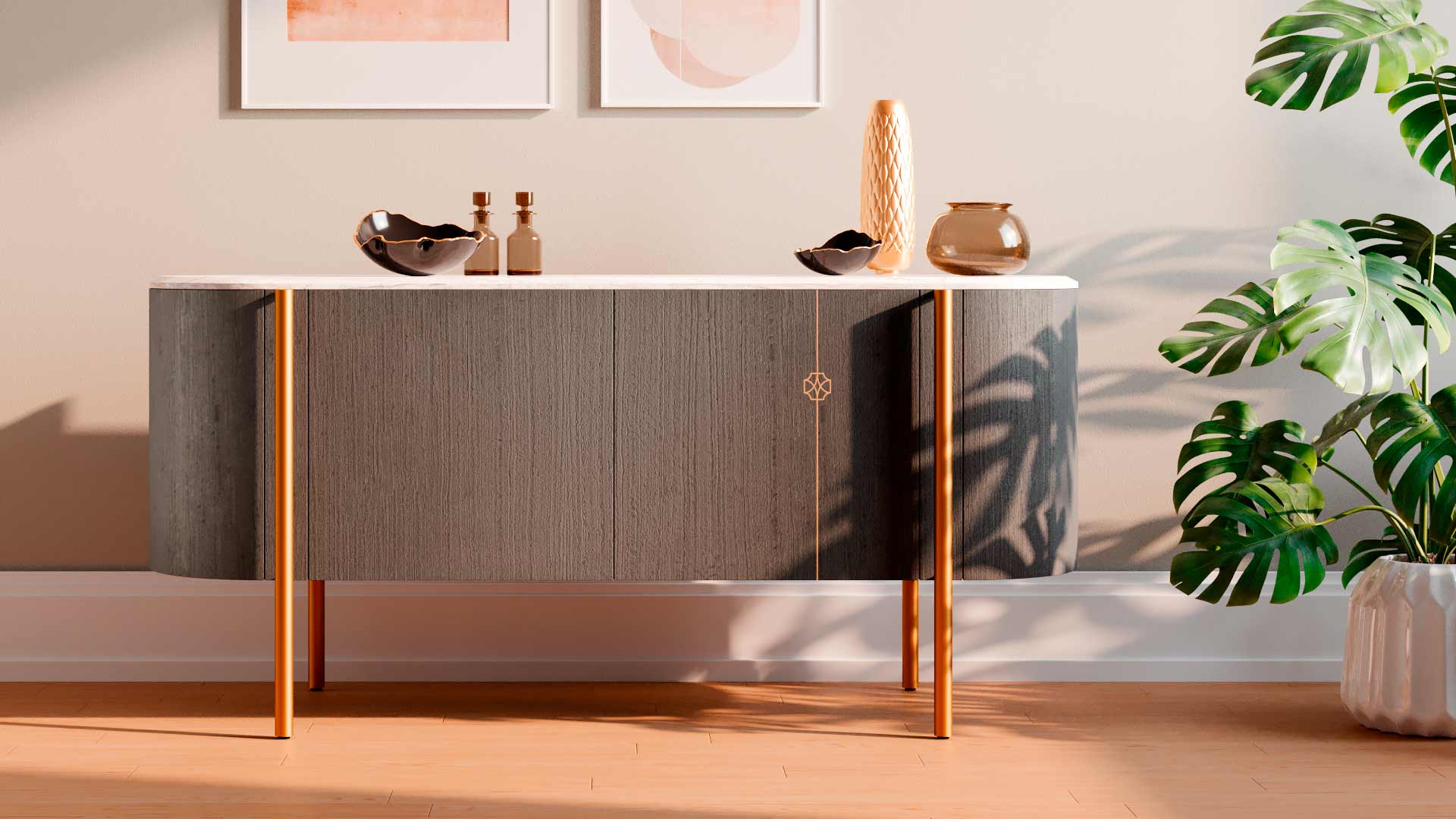
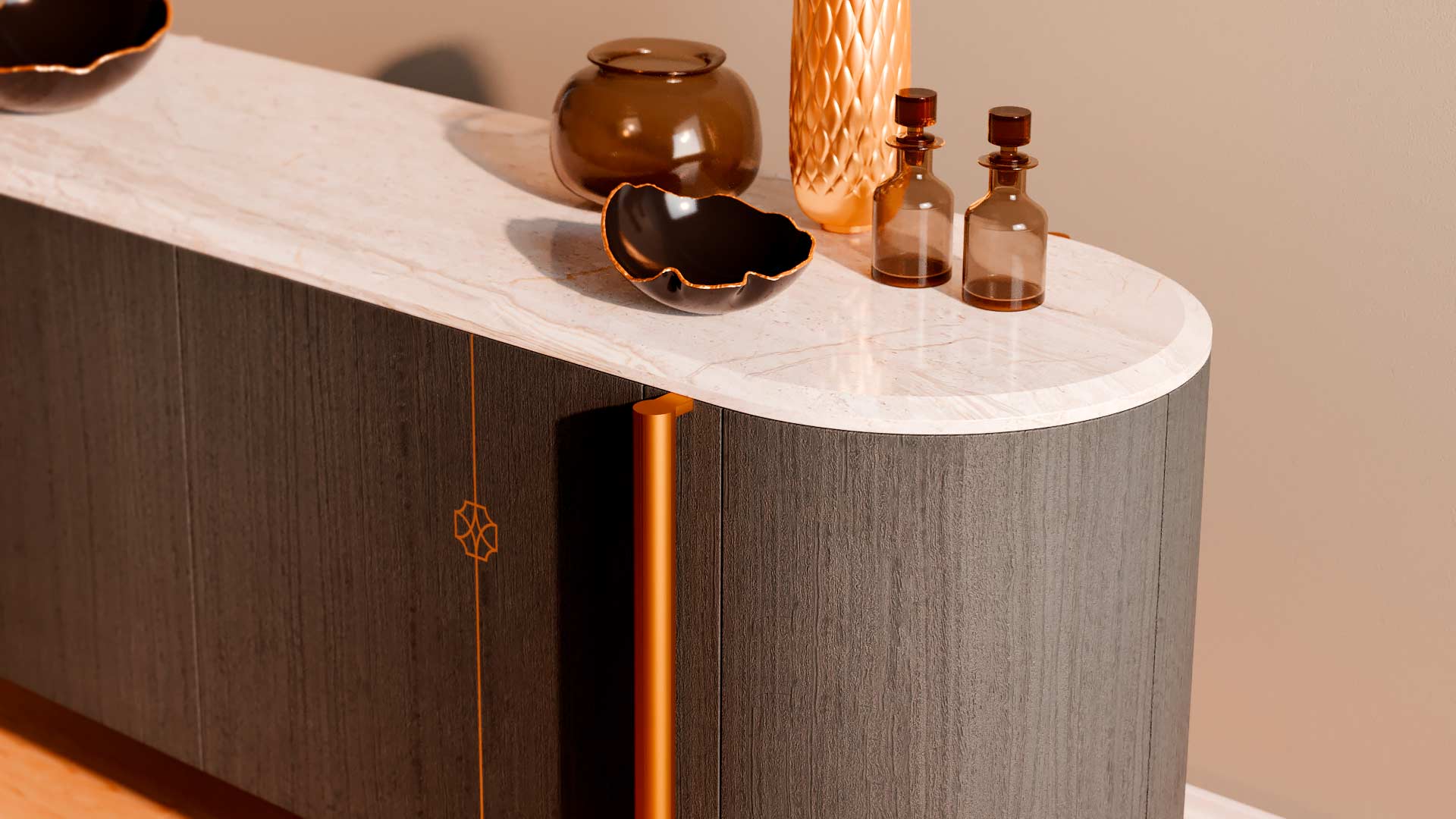
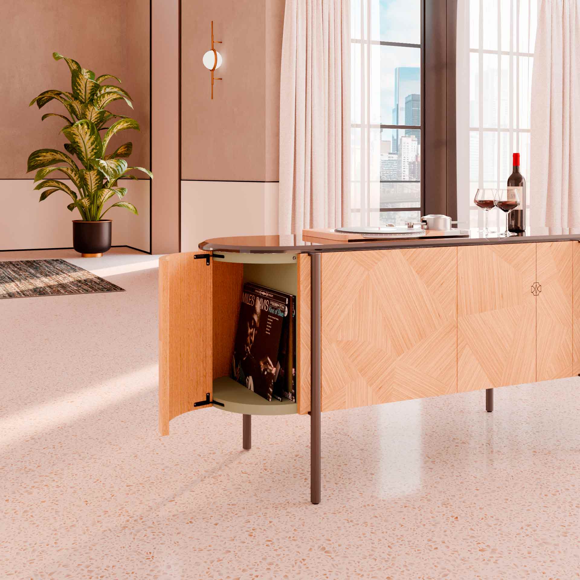
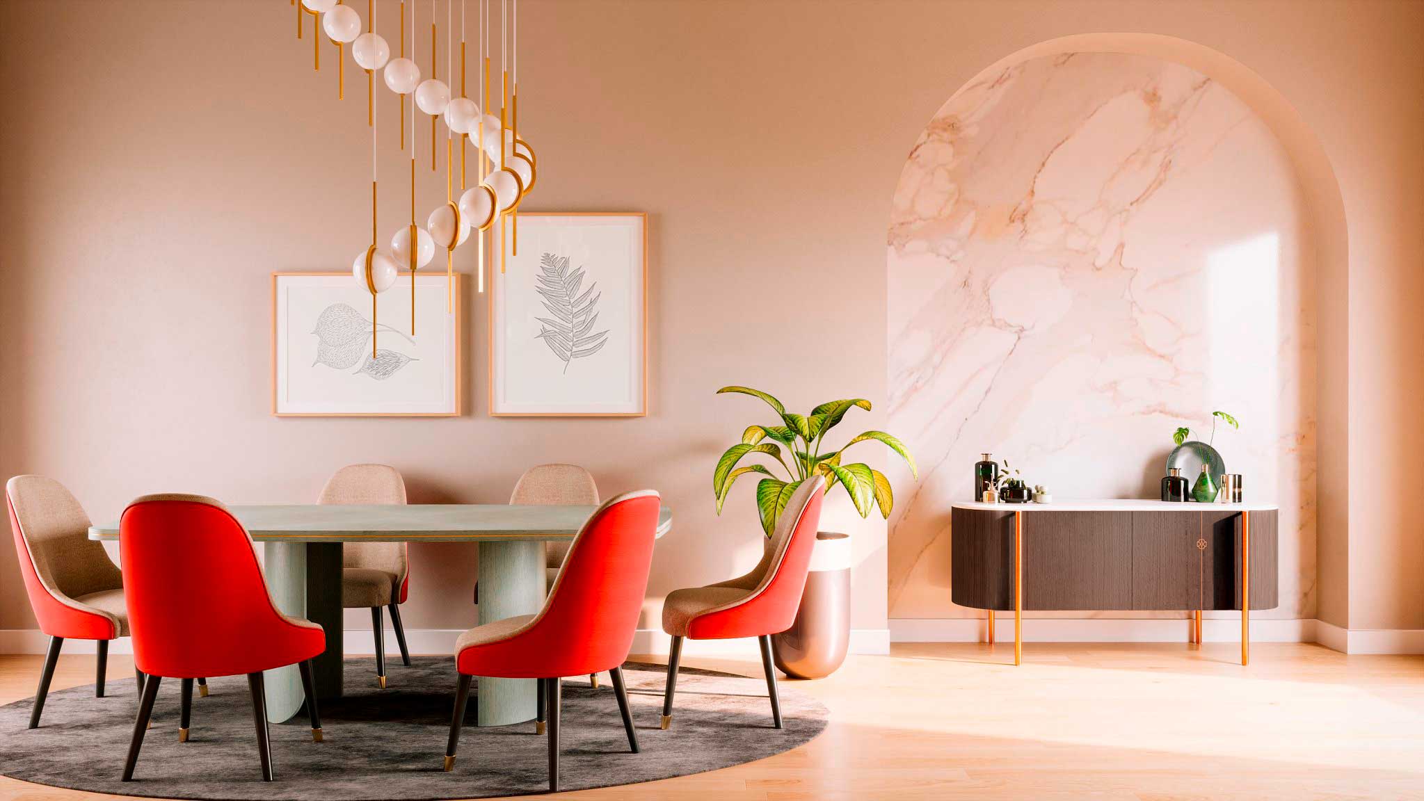
The new pieces, designed to meet the needs dictated by the new commercial strategy, share numerous manufacturing processes and materials, maximizing internal management and order fulfillment speed.
Each element was also designed following the pillars of lightness, honesty, moderation, and sharing: the materials used are certified and traceable, the design is sober and restrained, lightened in thickness and volumes, and finally, the production process is shared with the client through regular updates on the progress of the order.
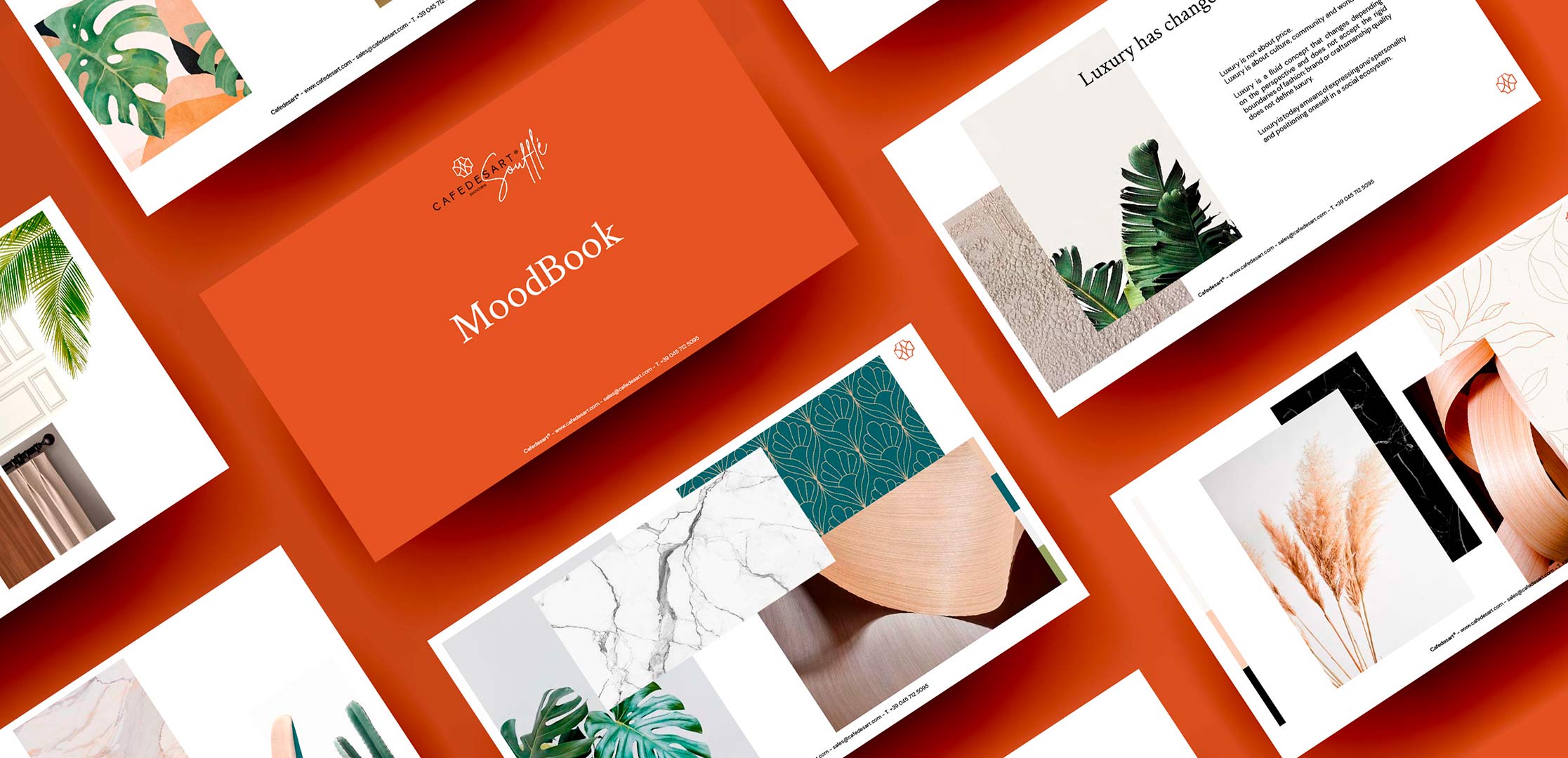
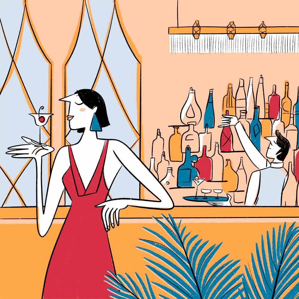
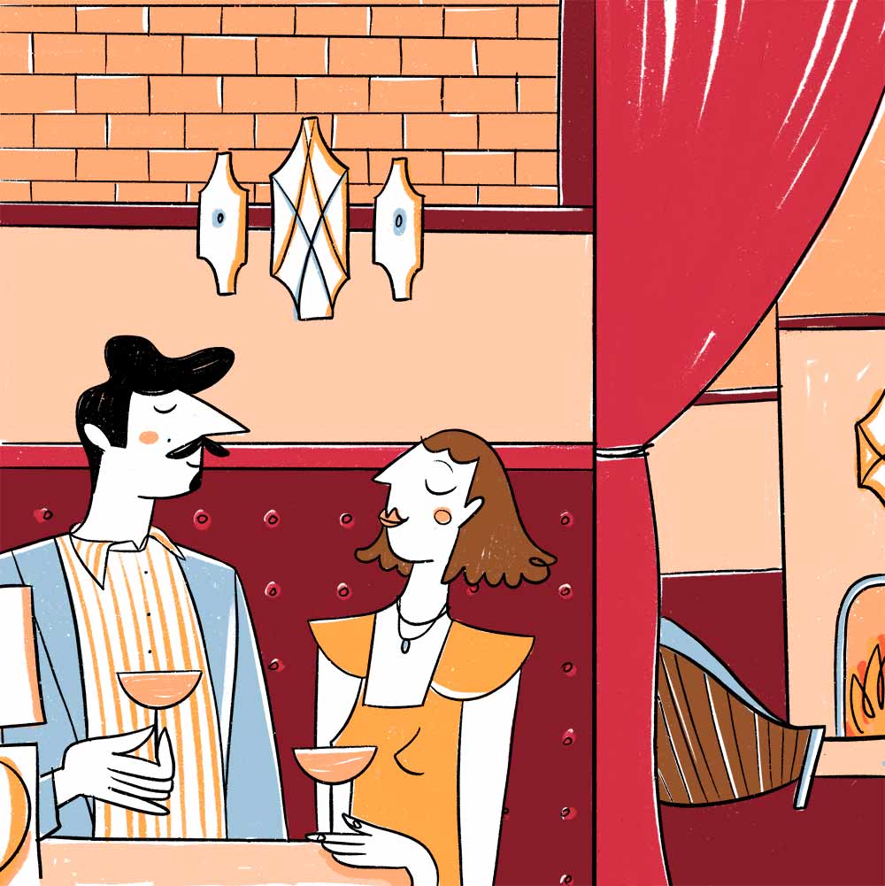
Alongside product design, HENRY & CO. worked on developing a new communication image for Cafedesart. In synergy with the established strategic direction, HENRY & CO. profoundly transformed the visual design of communications with an informal, illustrated, and colorful style aimed at a younger audience and a digital space.
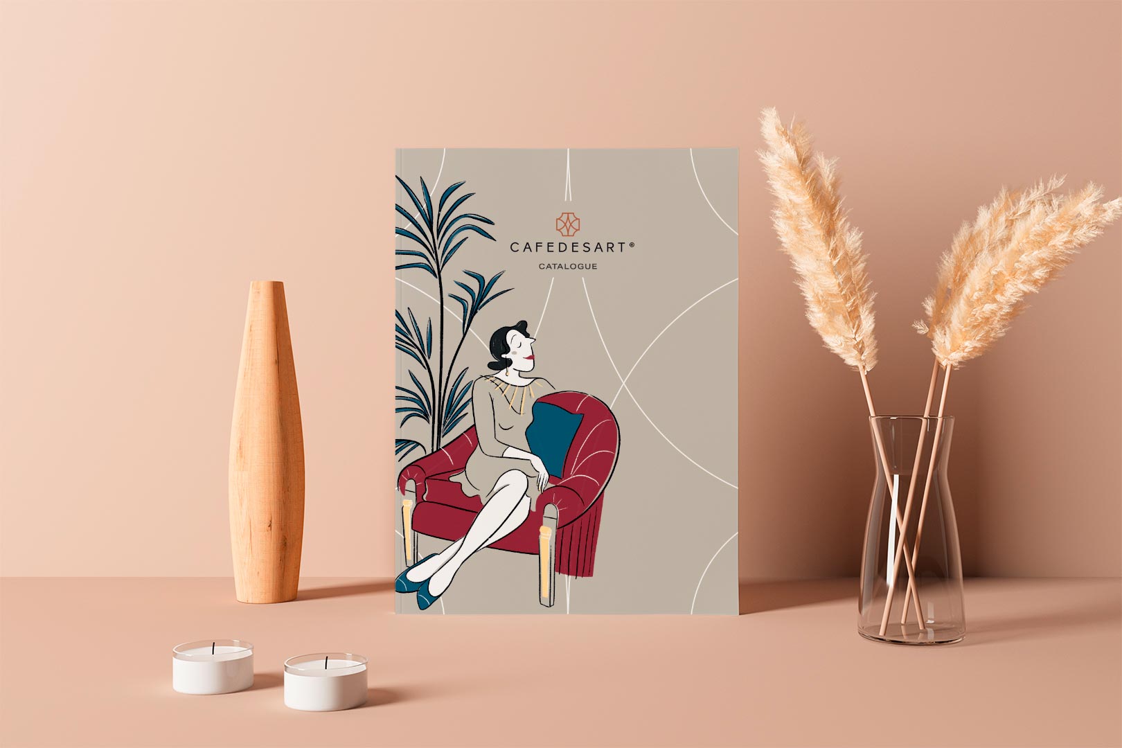
The new Cafedesart catalog aimed to consolidate all the changes determined by the process undertaken. The user experience was improved to facilitate simple and intuitive navigation, and each section was enriched with fresh and original illustrated language.
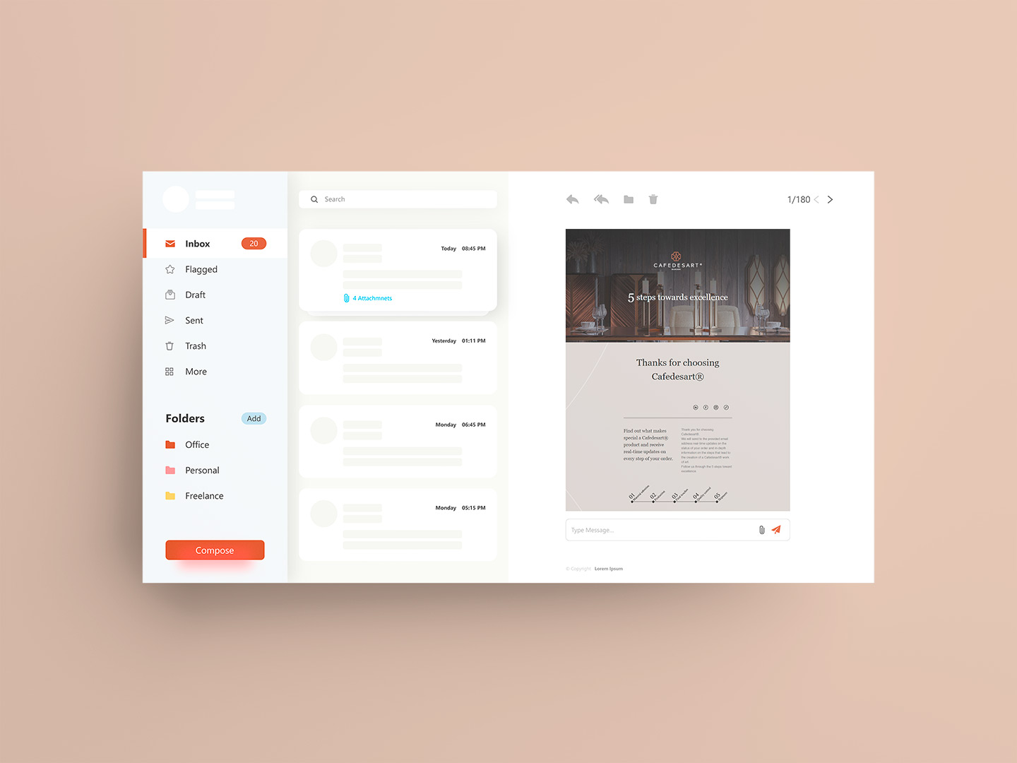
The strategic design activity promoted by HENRY & CO. also touched marketing and communication/commercial aspects. Thanks to Circular Design Thinking sessions, the team extracted the usual feedback systems from e-commerce and implemented them in the furniture sector: based on the production stage of the piece, the customer now receives communication reports on the status and photographs of their order in progress.
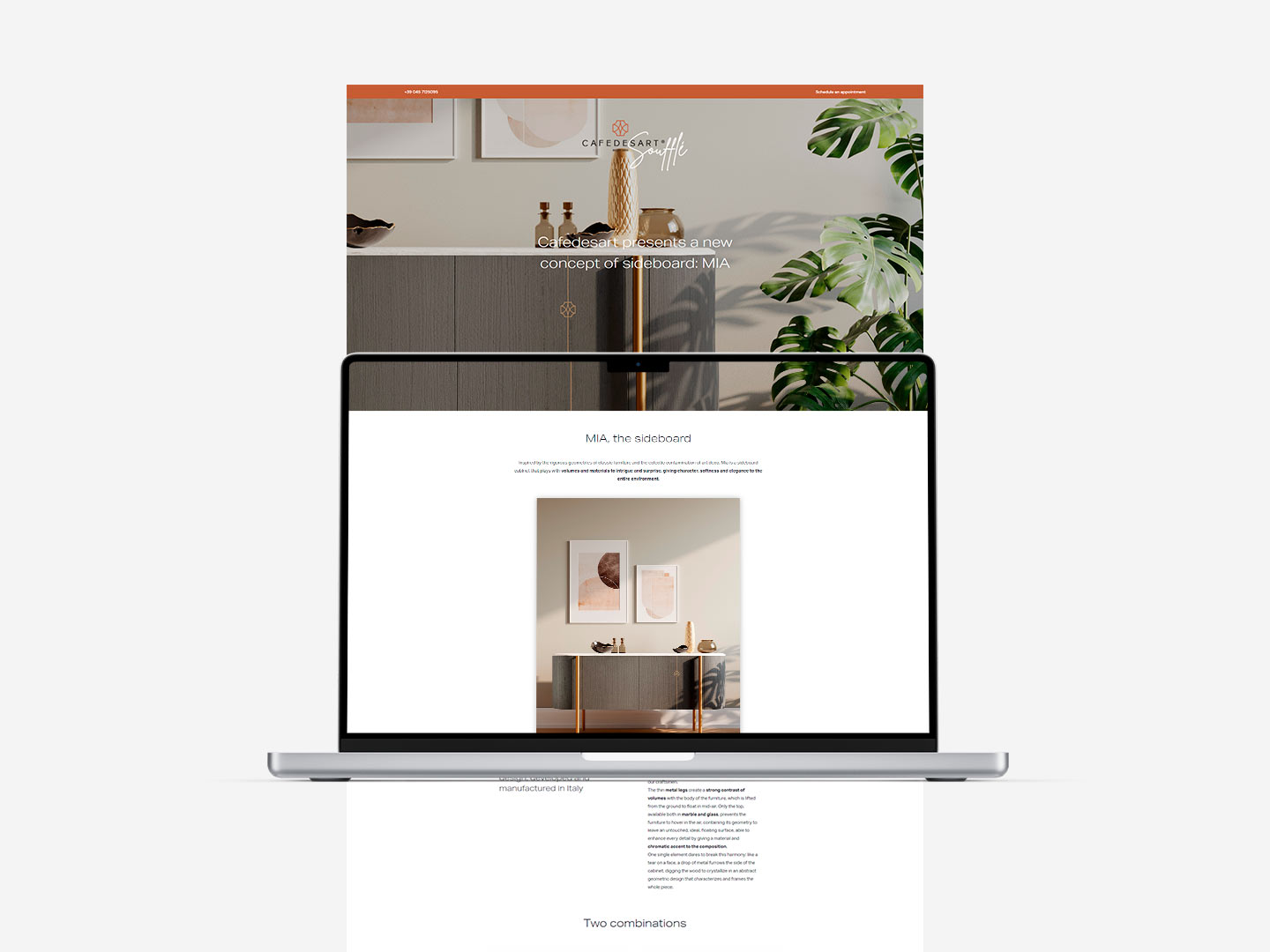
Alongside integrating feedback systems into customer relationships, HENRY & CO. developed numerous materials to support commercial activities, from printed materials to landing pages created ad hoc, depending on the commercial objectives.
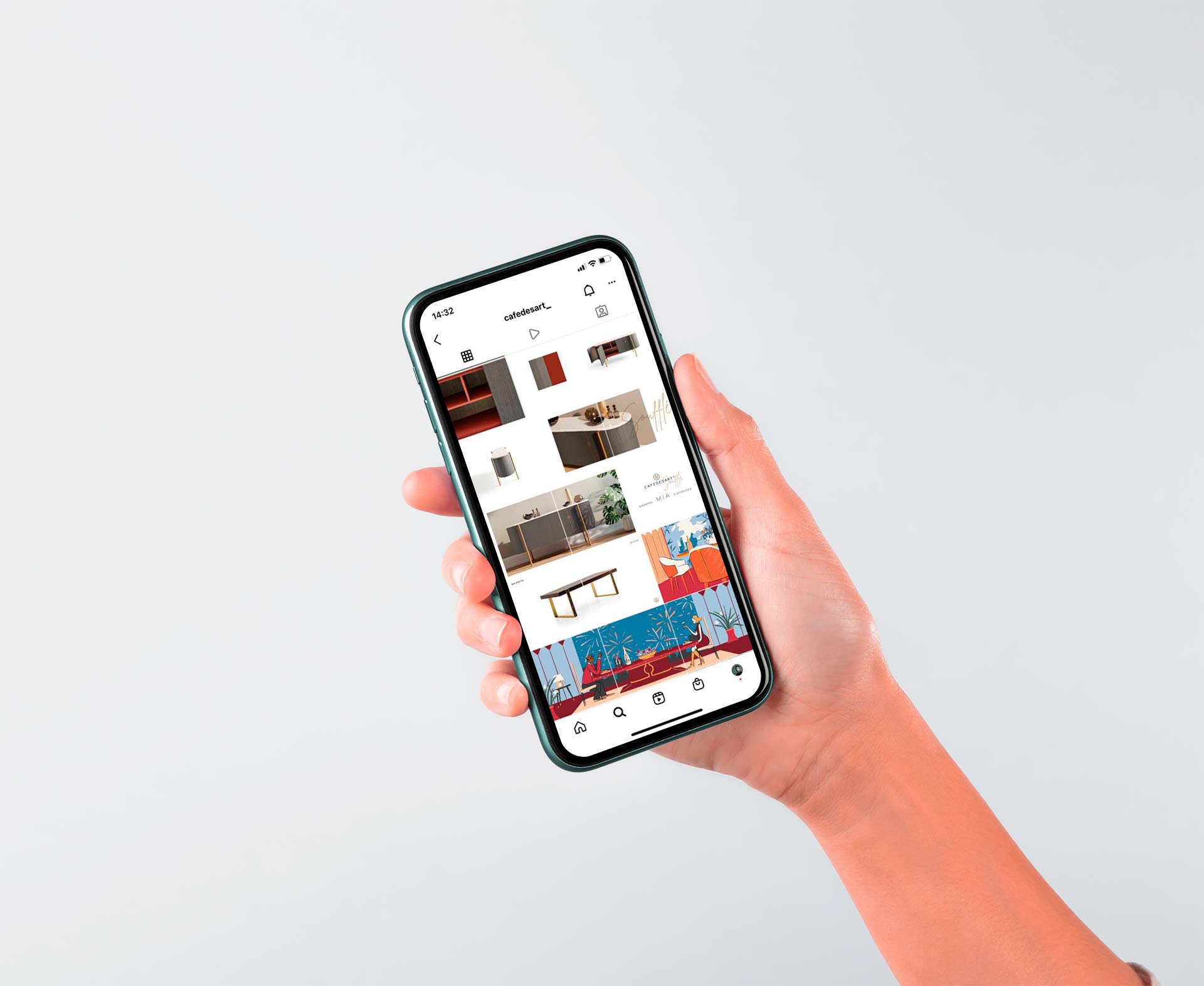
HENRY & CO. was also engaged in managing social media channels. Based on the strategic direction, HENRY & CO. developed an editorial plan for LinkedIn, Instagram, Facebook, and Pinterest, transforming the company’s profiles into real commercial channels.
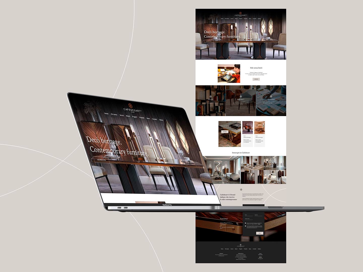
HENRY & CO.’s involvement also extended to the company’s website, with an update focusing primarily on aesthetics. The website was updated to align with the company’s new image, with lightened sections to maximize speed and ease of use.
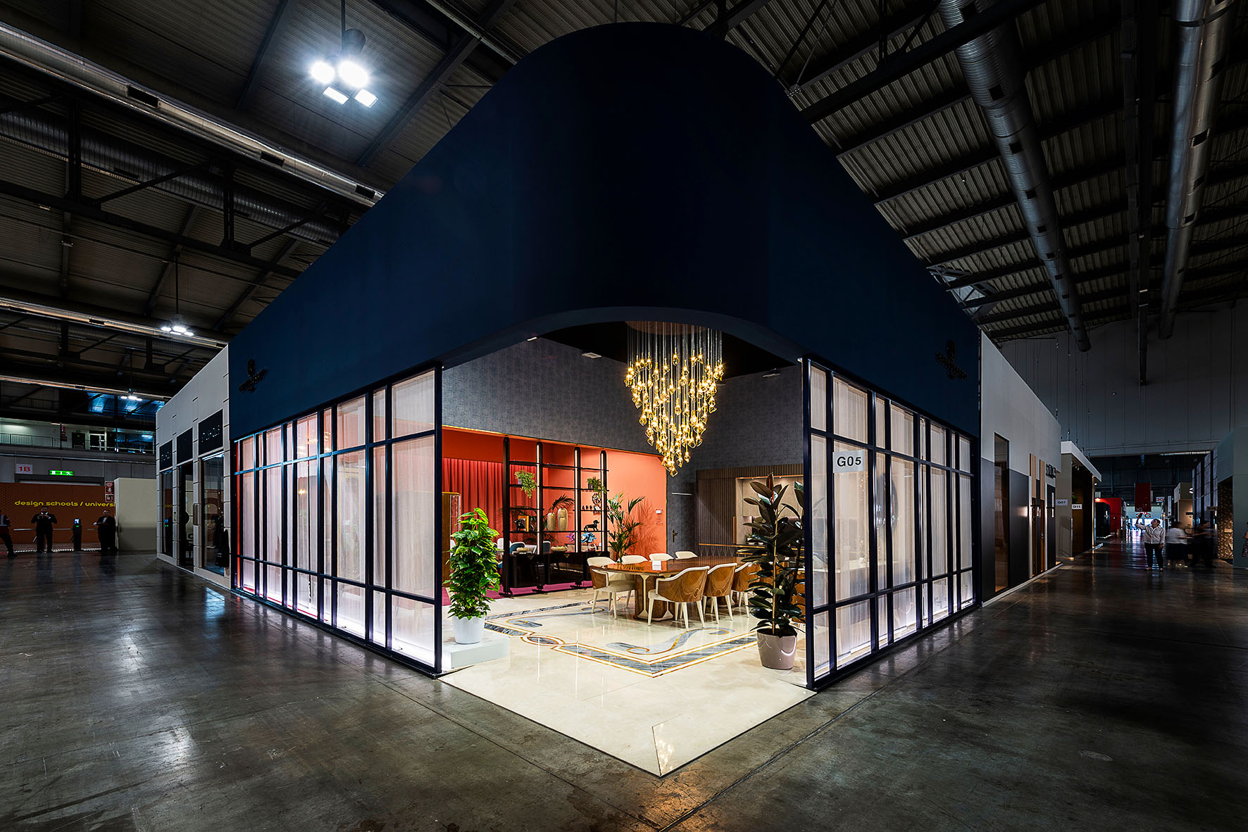
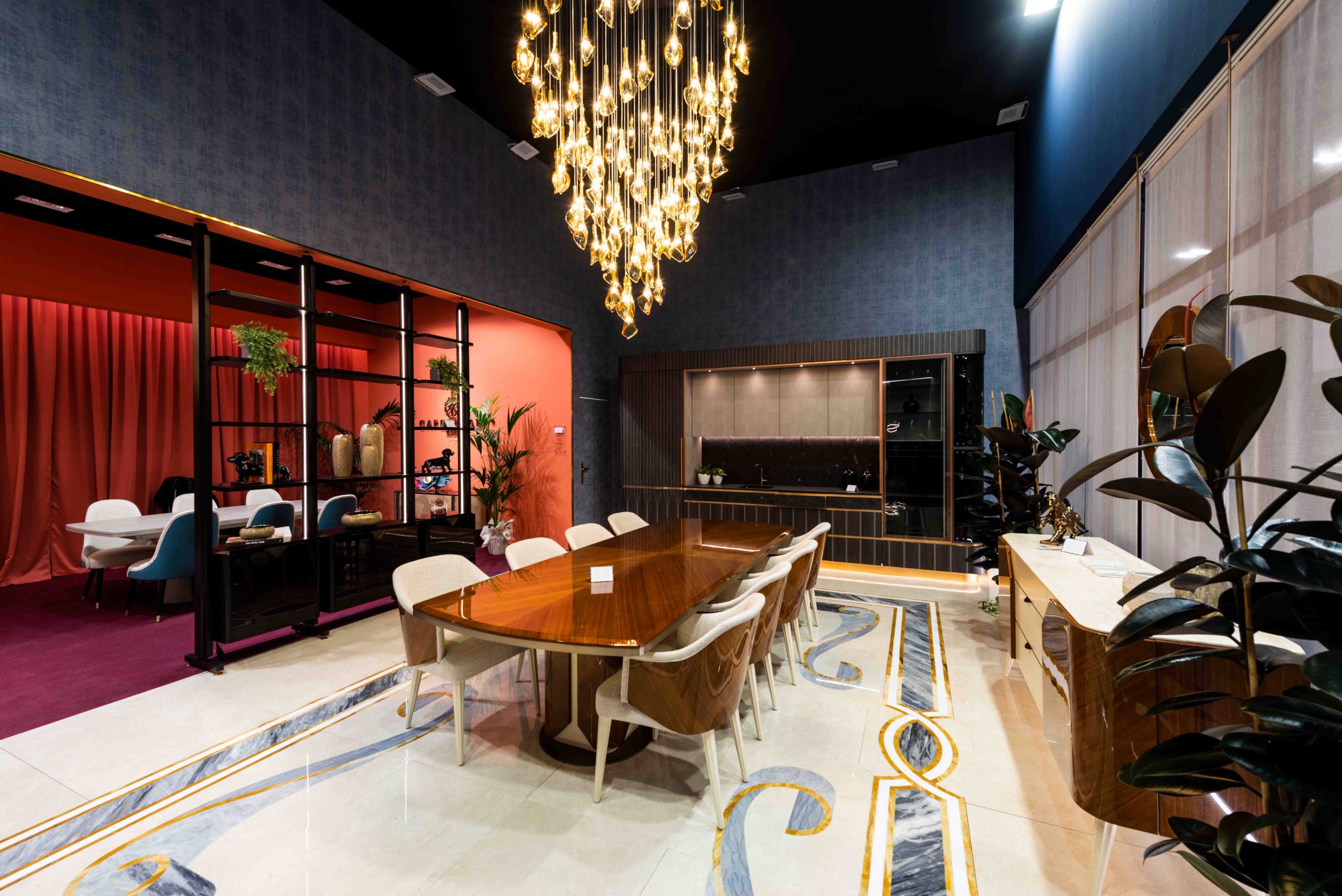
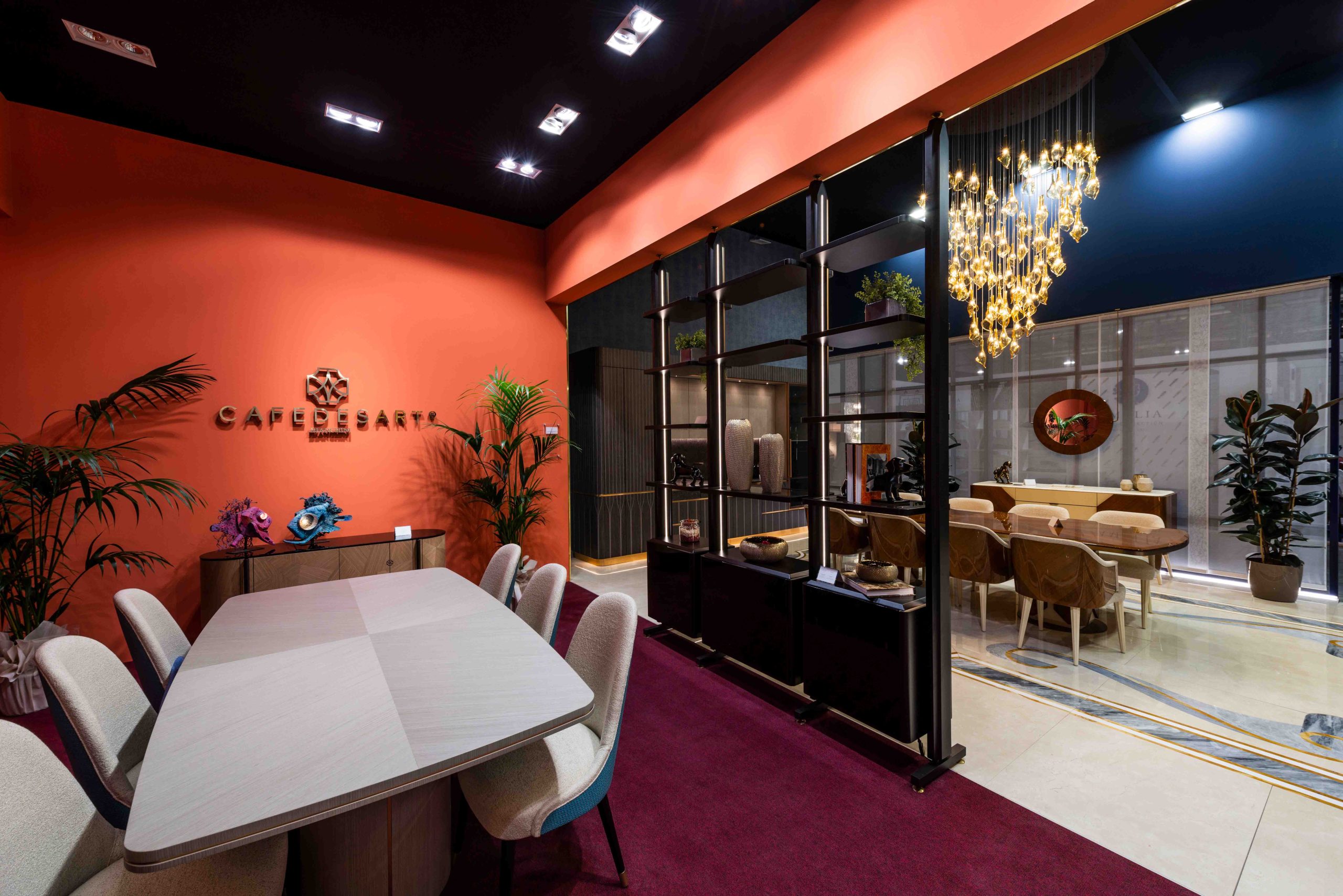
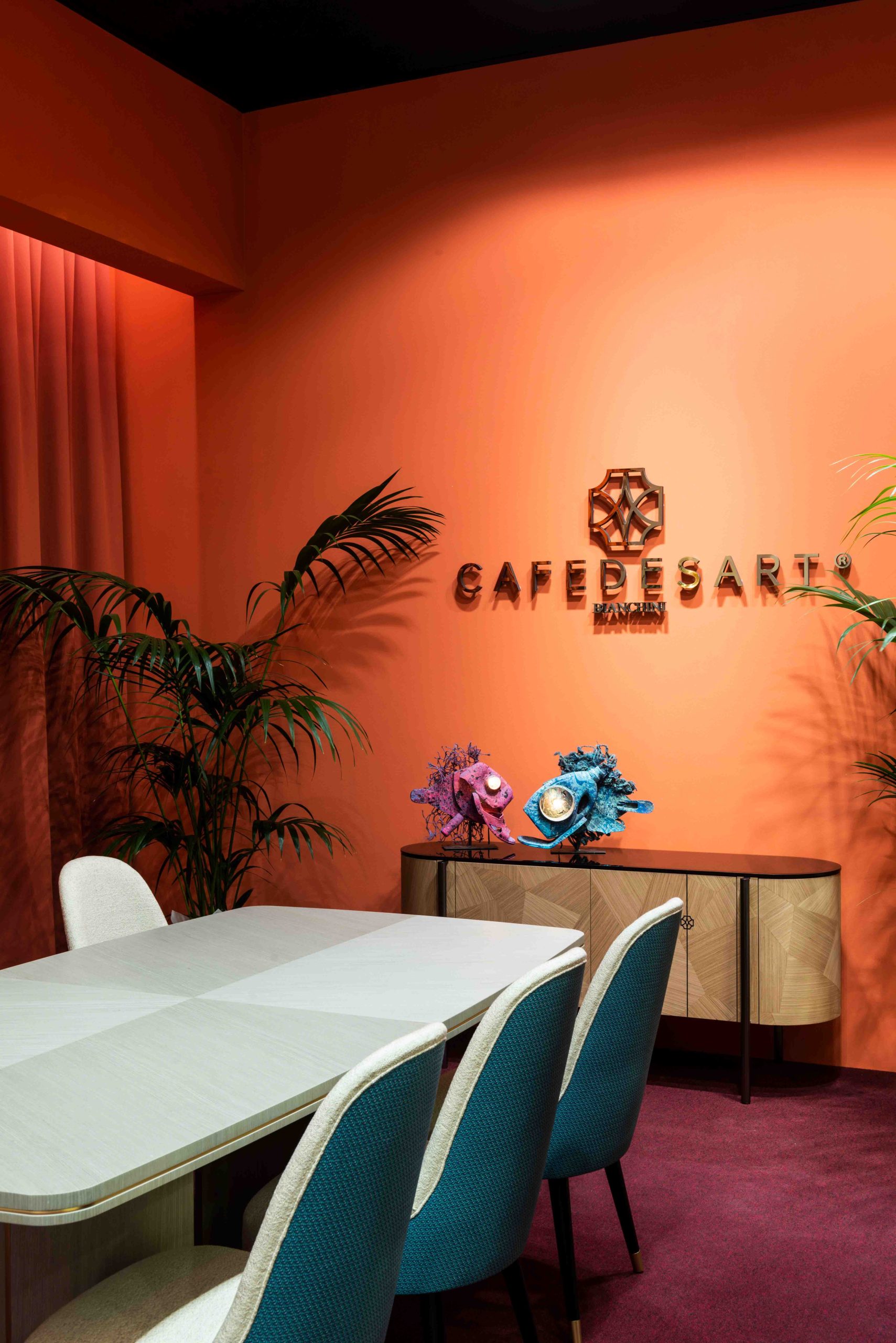
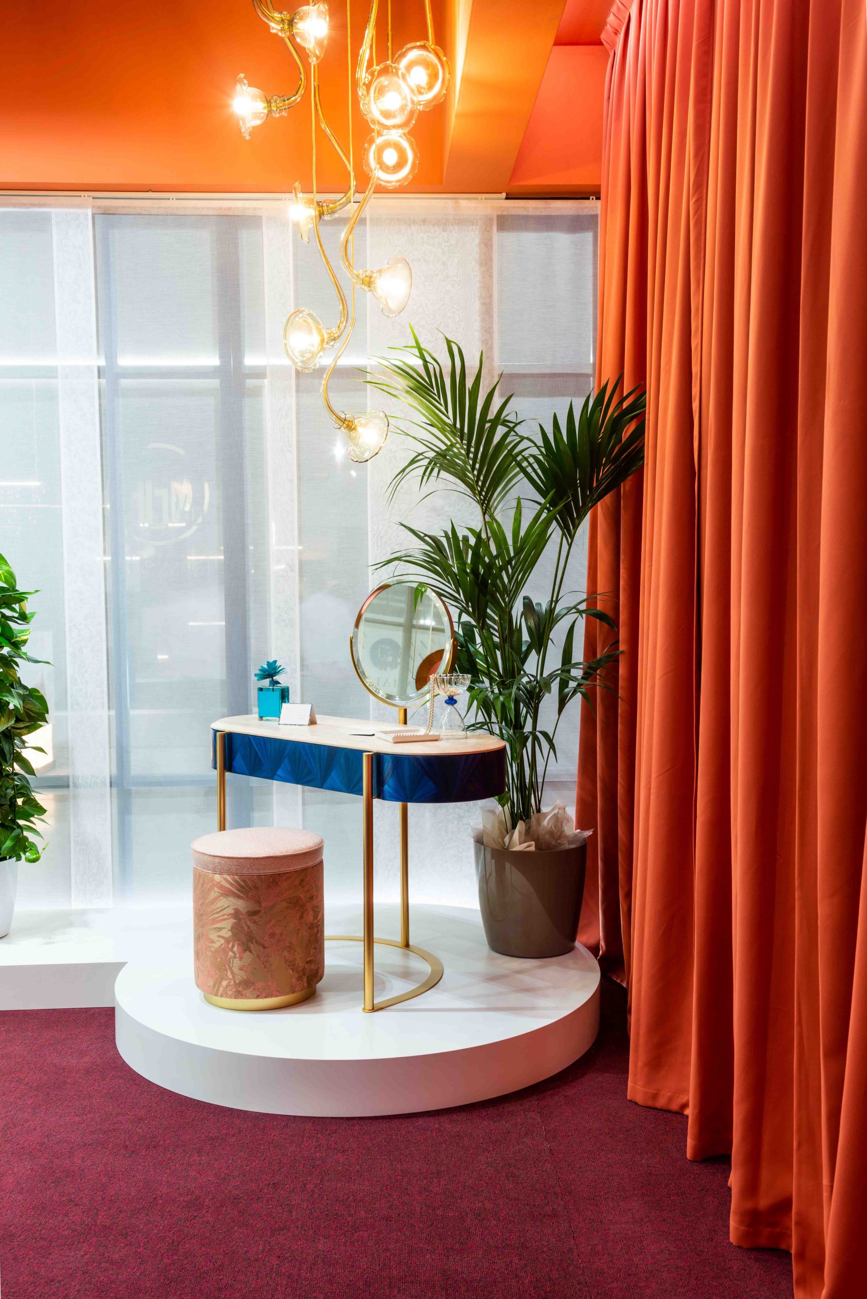
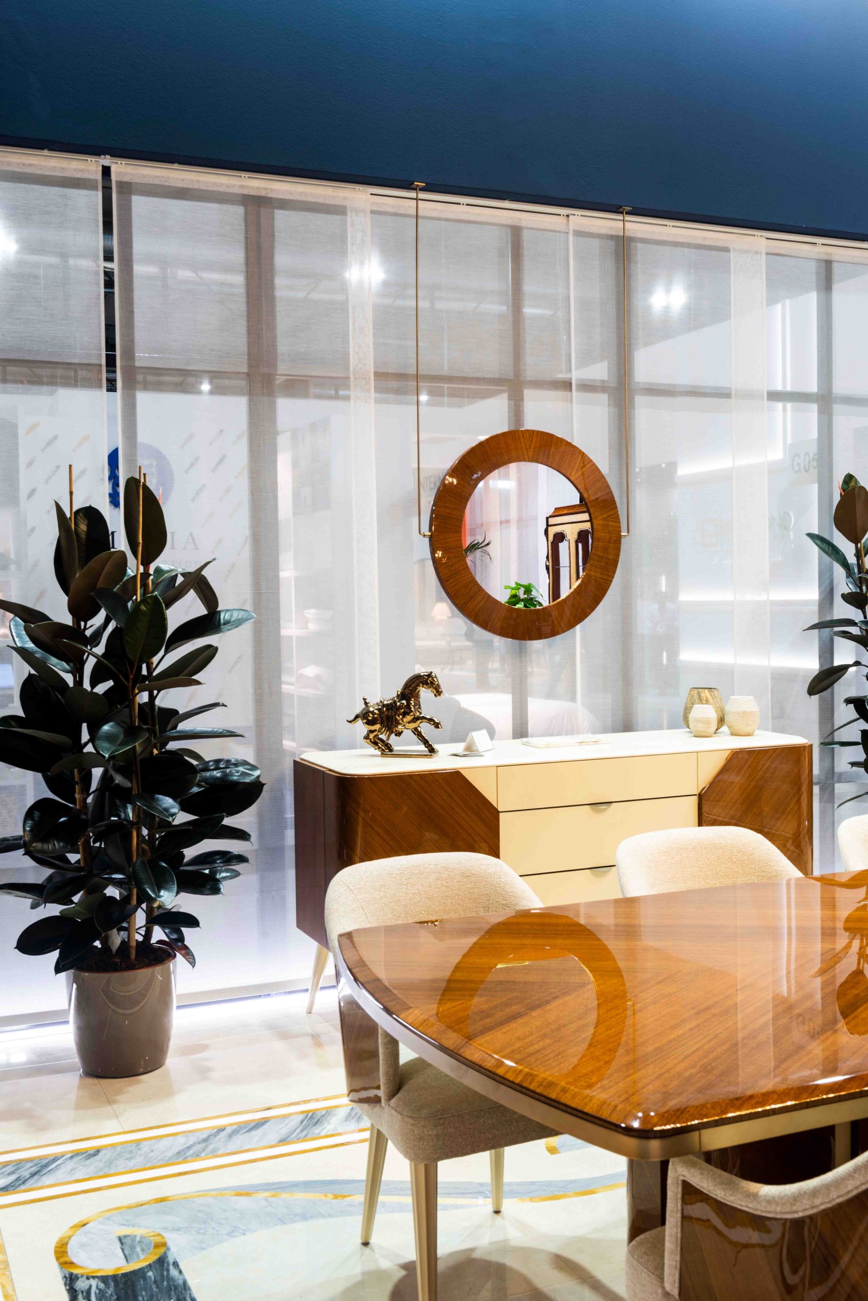
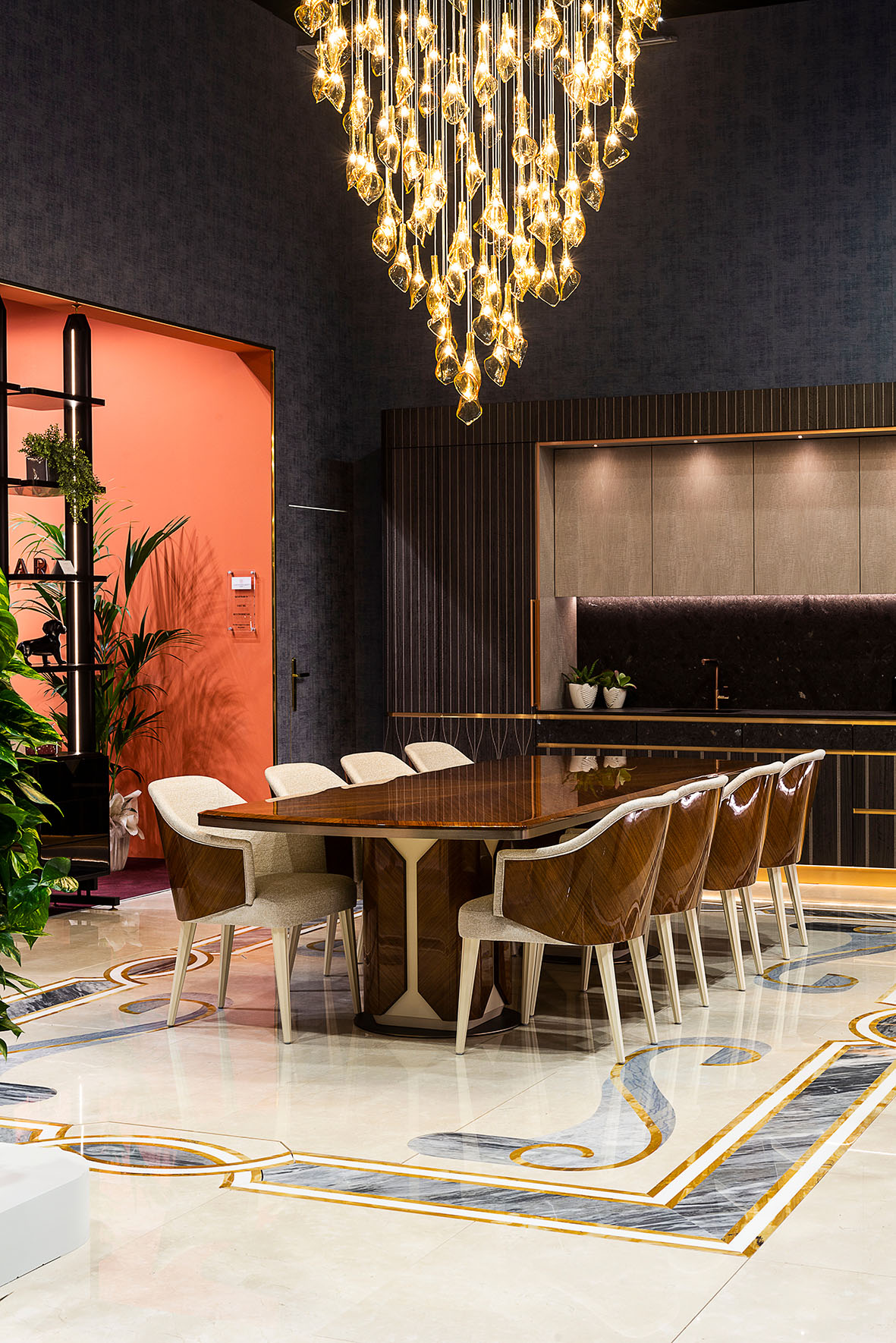
HENRY & CO. designed Cafedesart’s booth for the Salone del Mobile 2022 with particular attention to sustainability. The stand was designed and built to be recovered and reused as much as possible: the external metal structures, drapes, and carpeting will be used in the new Cafedesart showroom, and the wallpaper was applied on removable panels for future reuse.
In line with collaboration and reuse principles, the marble floors were created by Takt Sensitive Marble, an Italian company specializing in transforming marble into exclusive works, while the lighting was provided by Multiforme lighting, a historic Murano glass furnace specializing in luxury lighting.
At the end of the show, over 70% of the stand was fully recovered.


