Challenge
Designing Brand Identity and packaging for the London-based supplement startup The Human Supplement
Result
Logo, brand identity, packaging design
Client
The Human Supplement
SDGs
The Human Supplement is a new London-based startup specializing in dietary supplements. The founder’s many years of experience in the fitness world led to the realization that every person is, to some extent, lacking in some aspect of their diet. Aware that true physical well-being requires a balanced relationship between exercise and diet, the founder created The Human Supplement to offer specific dietary supports and make nutritional well-being accessible to everyone.
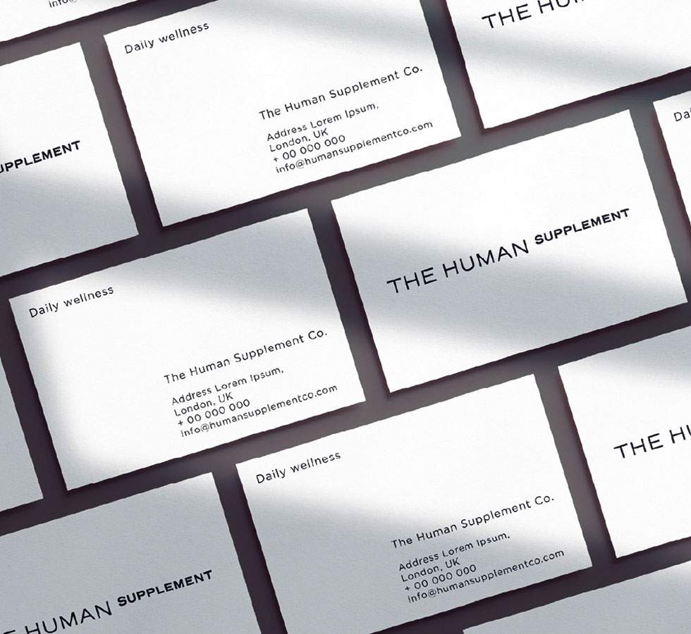
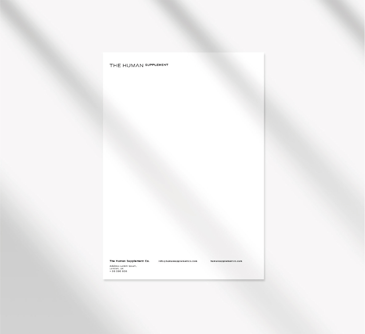
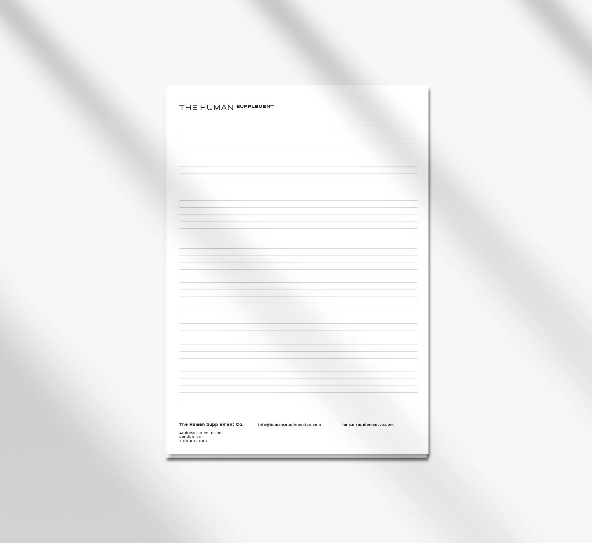
The brand identity created by HENRY & CO. for Human Supplement is based on the balance between two fundamental components of the brand’s voice: a simple, direct, and accessible component aiming to reach a broad and diverse target, and a scientific, measured, and precise component aimed at emphasizing the professionalism, accuracy, and scientific nature of the products offered.
From these two elements, HENRY & CO. developed a simple, minimalistic, and high-impact logo, where human beings take center stage and the supplement elevates them, referencing the scientific semantics of mathematical language. All of this is encapsulated in the payoff “Daily wellness“, emphasizing the startup’s ultimate goal—nutritional well-being—and its daily commitment to caring for individuals.
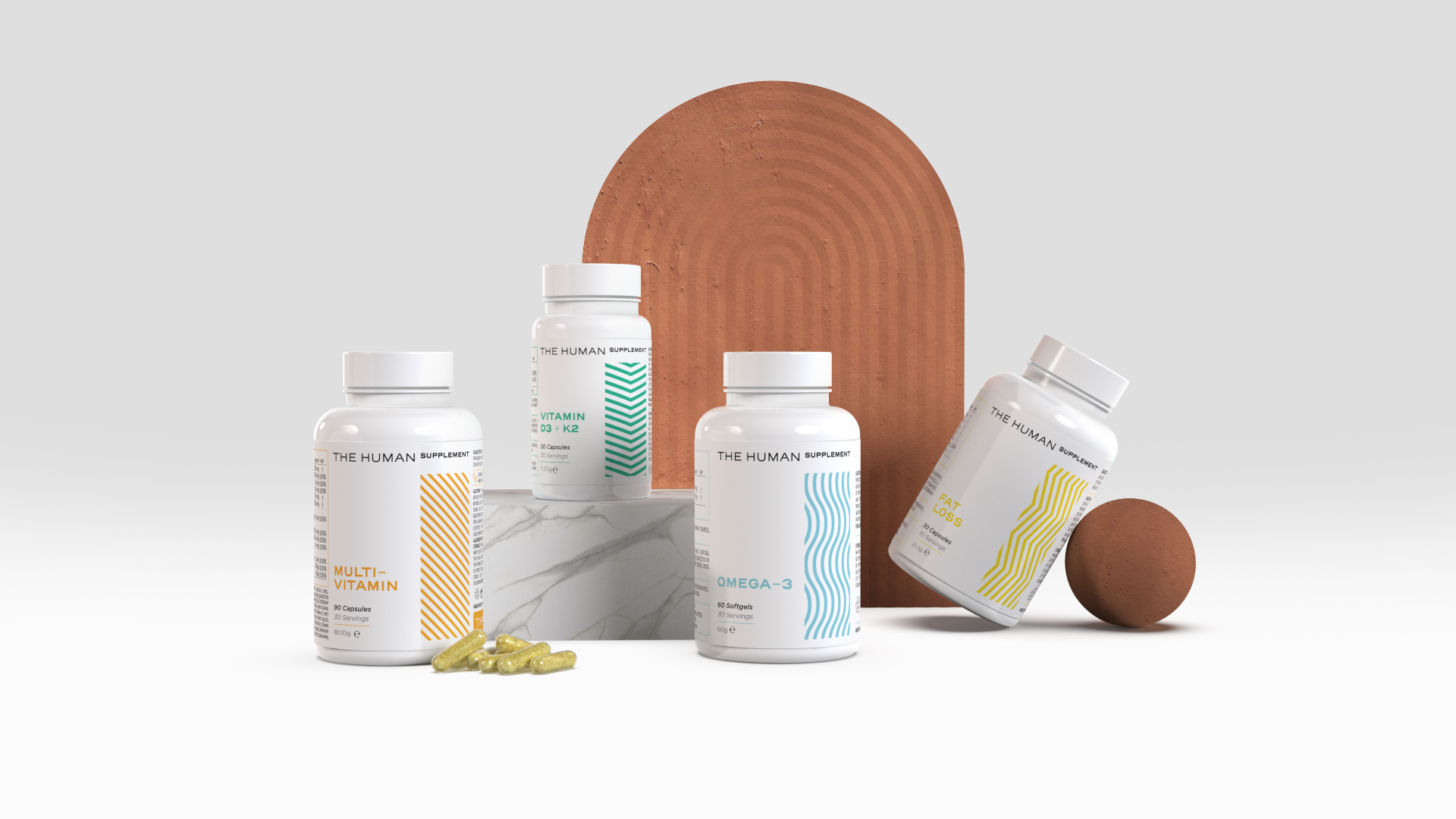
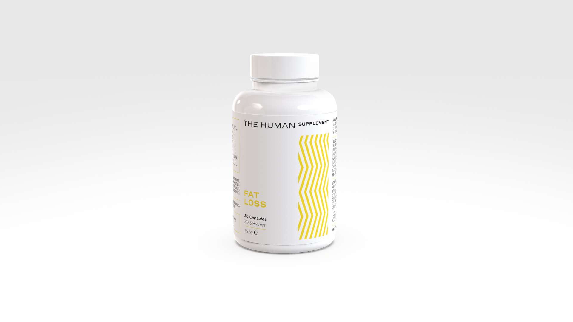
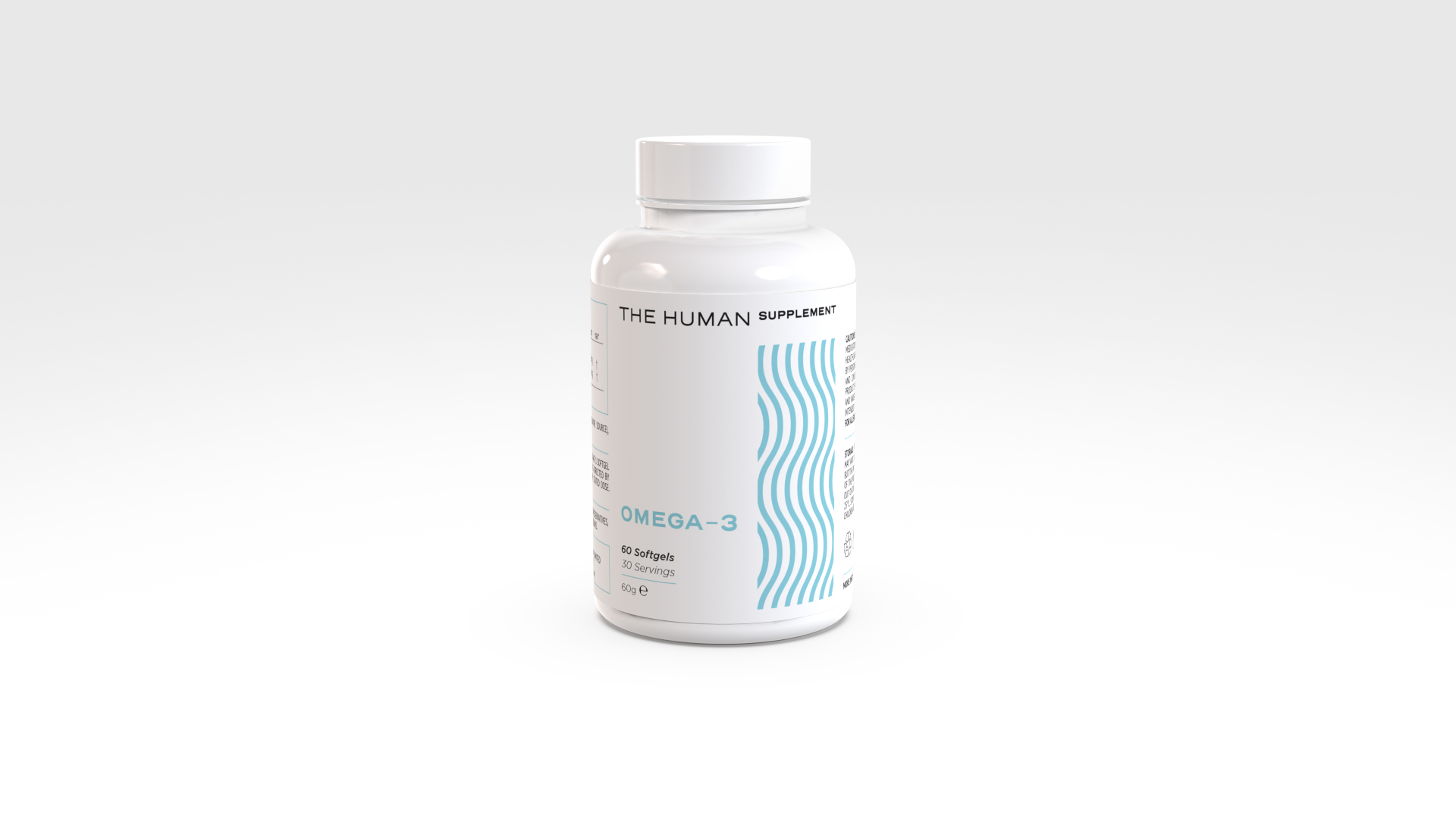
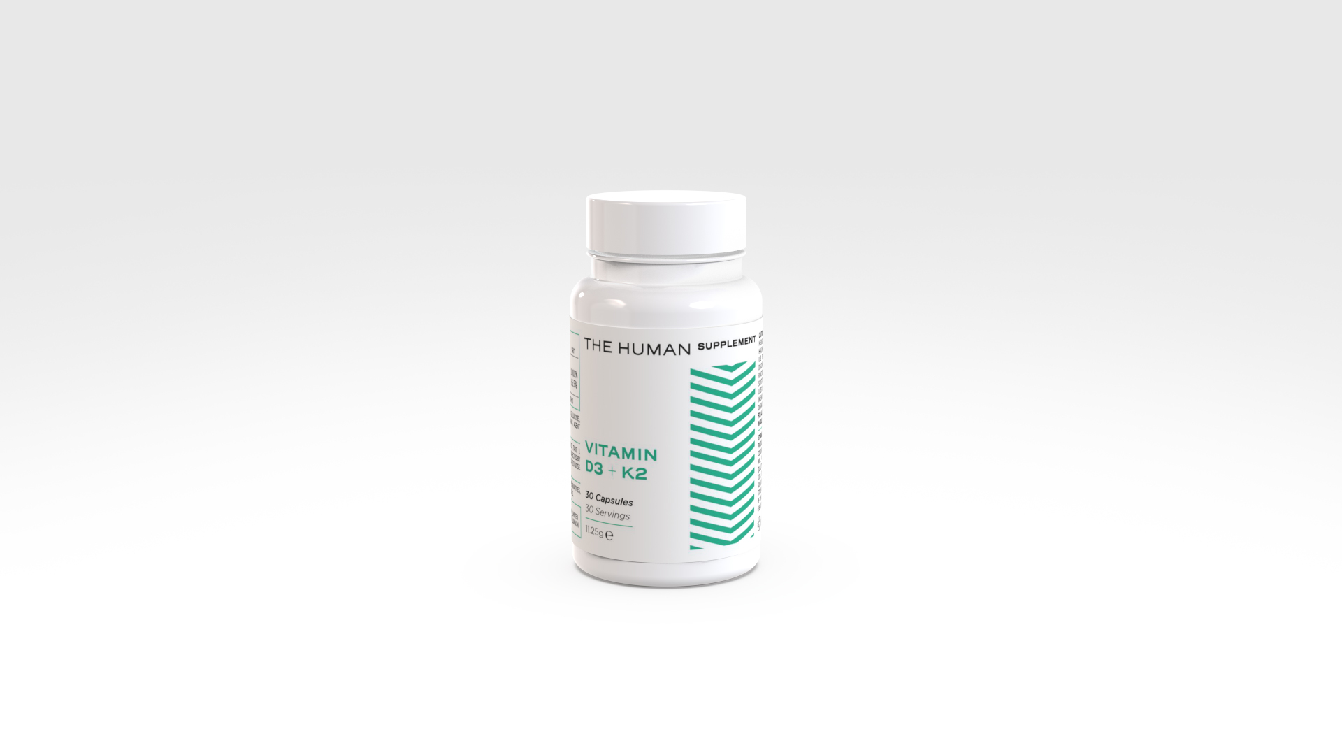
Starting from the minimal lines of the logo, HENRY & CO. developed a series of textures and color palettes to distinguish the various supplements within The Human Supplement’s product line. Each product is thus associated with a specific line and color, simplifying its recognition and giving it a unique identity while maintaining consistency with the linear and minimalistic brand identity.
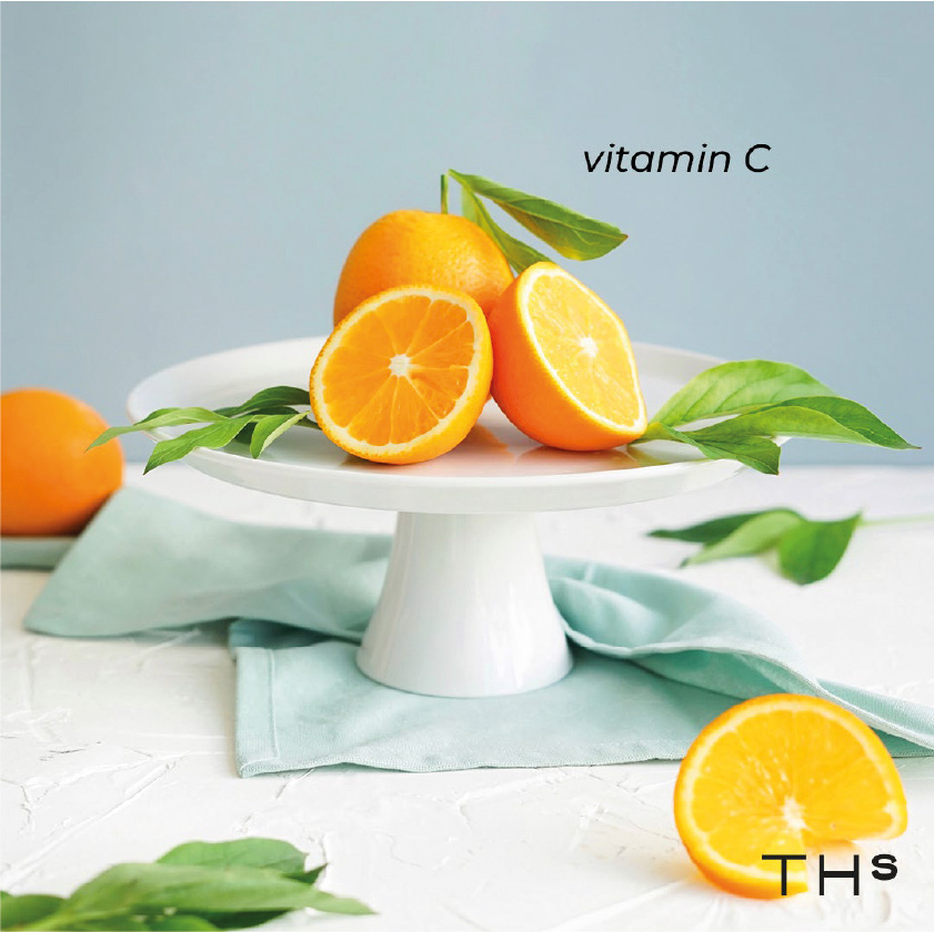
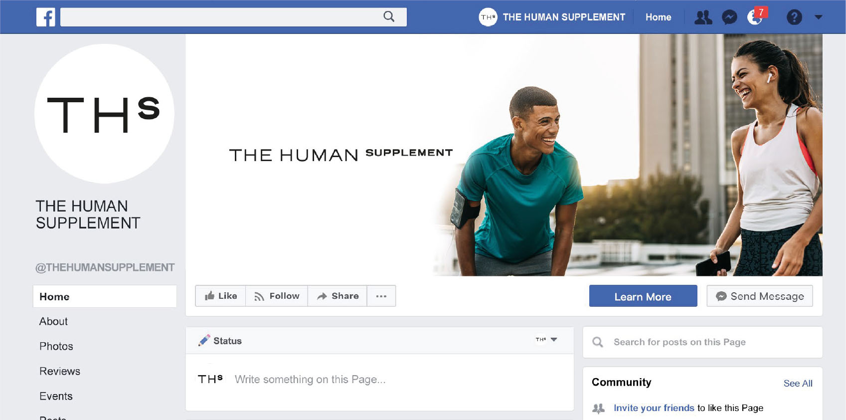
With the product line’s characterization and the introduction of textures and colors to the brand identity, HENRY & CO. developed a series of templates and graphic elements aimed at the brand’s social communications.
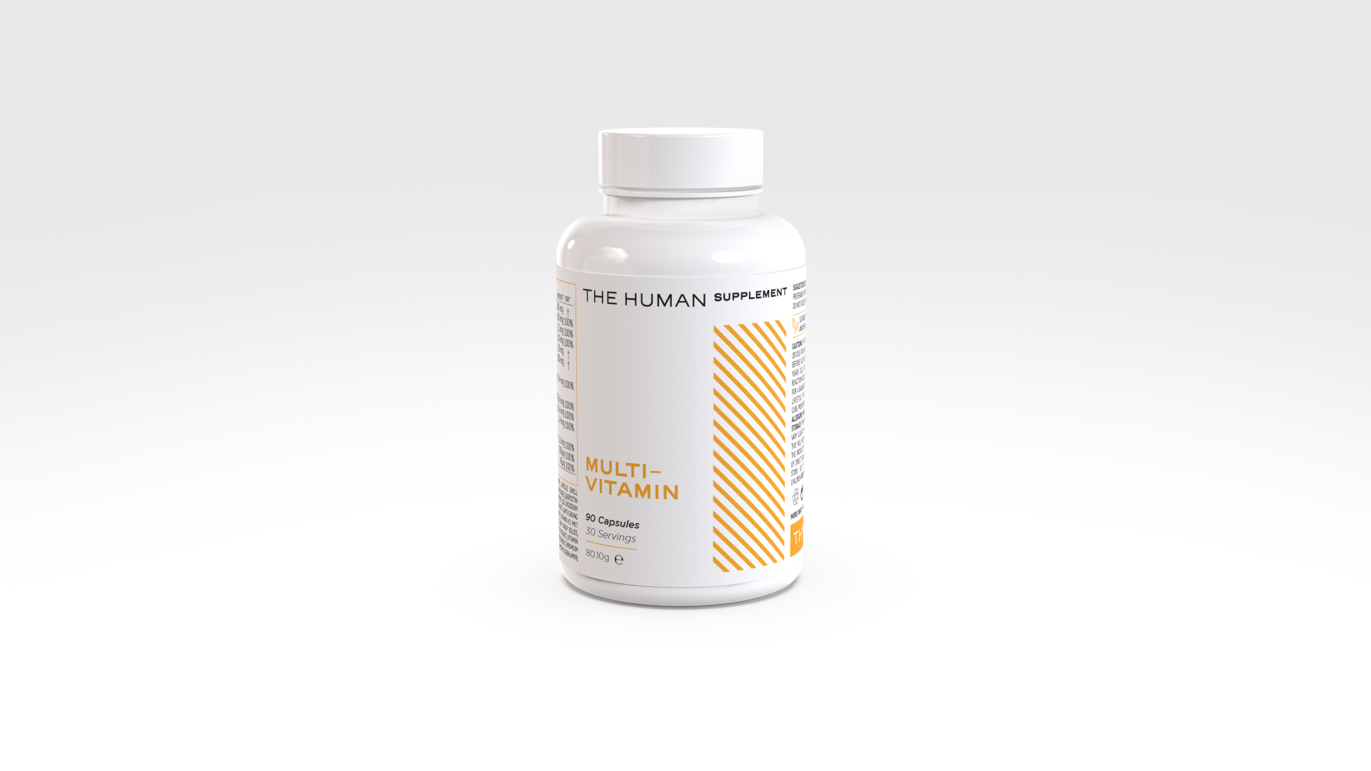
After establishing the brand identity, HENRY & CO. proceeded with the development of the packaging, opting for a single-material white bottle made of recyclable polymer, capable of preserving the product at its best. The label design aligns with the brand identity, characterizing each product with its texture and color, and effectively incorporating usage and recycling information.
