Packaging design for Mielizia-Conapi's food supplements for large-scale distribution
Branding
Challenge
Designing the new graphic look of Mielizia - Conapi's food supplements aimed at large-scale retail
Result
Food supplement packaging design
Client:
Mielizia - Conapi
SDGs
Mielizia is the historical brand of beekeepers from CONAPI, Consorzio Nazionale Apicoltori, the large cooperative enterprise of Italian honey producers, holding the title of the largest producer of organic honey in Europe.
Mielizia’s goal is to defend the well-being of bees and to promote the products of beekeepers, their productions, and the entire Italian supply chain.
Mielizia reached out to HENRY & CO. for the redesign of the packaging for the food supplement lines intended for large-scale distribution (GDO).
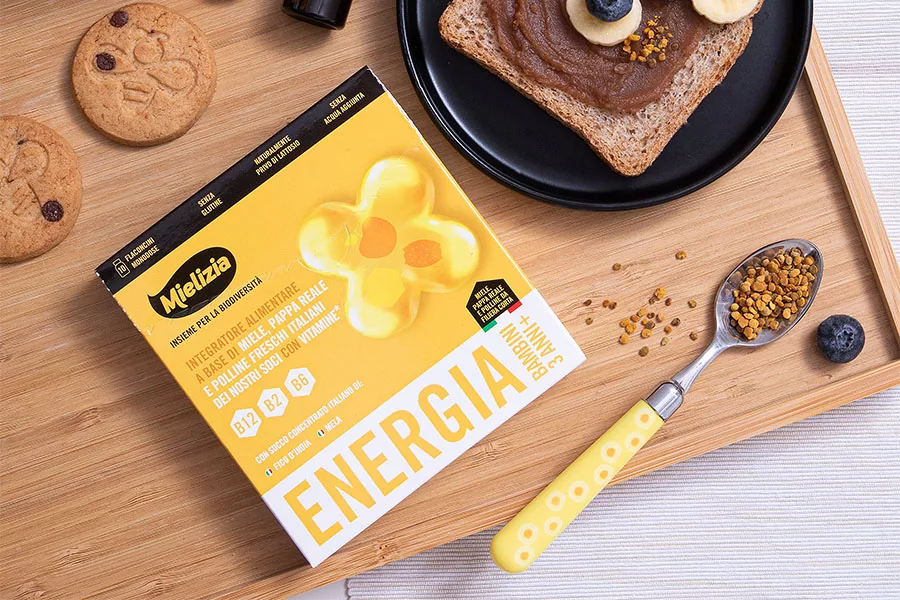
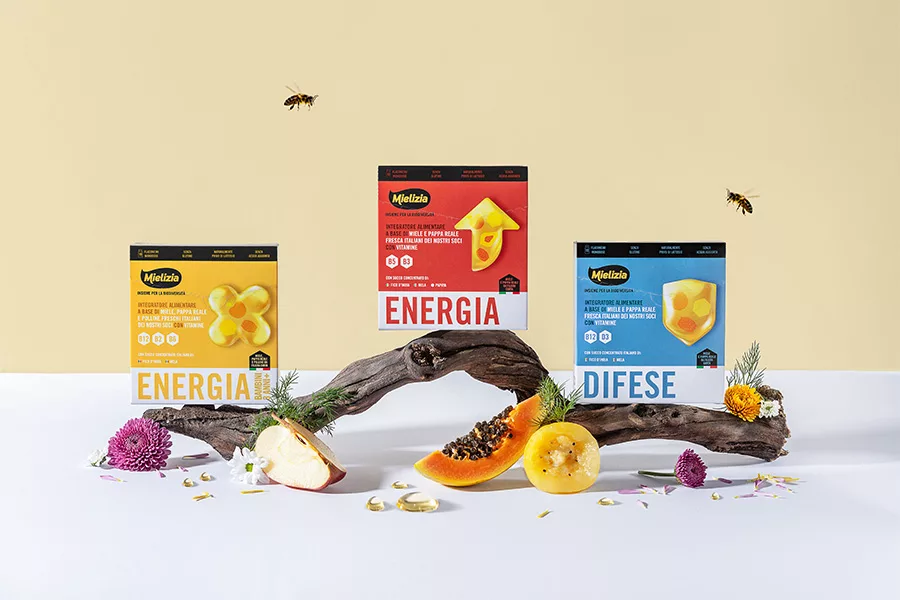
The design developed by HENRY & CO. for the new product lines plays on the characteristic brand elements of Mielizia.
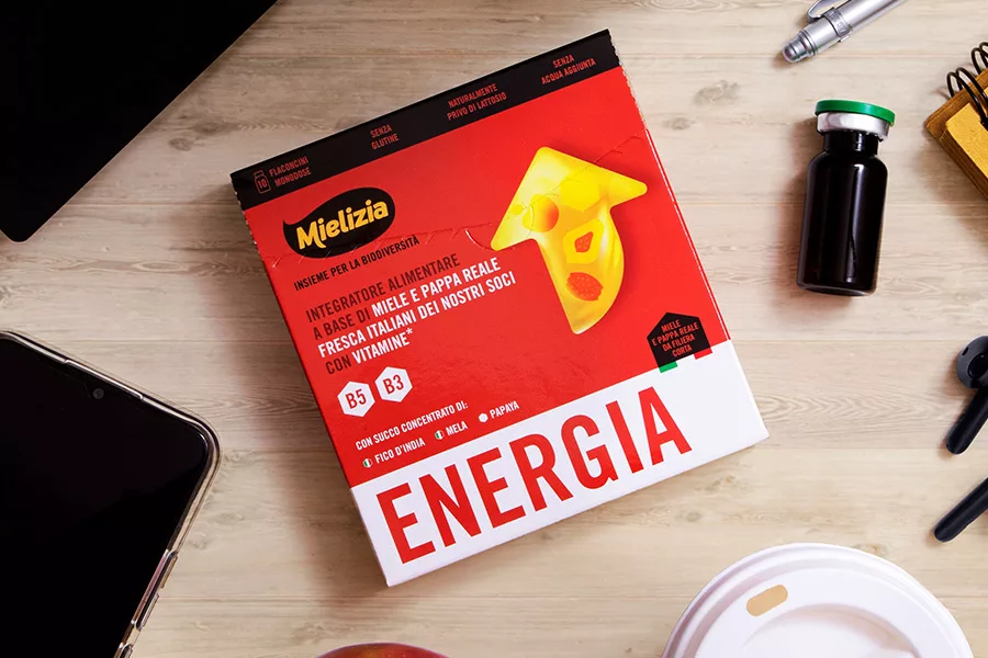
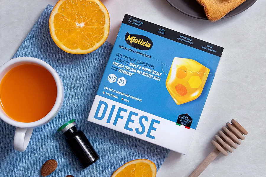
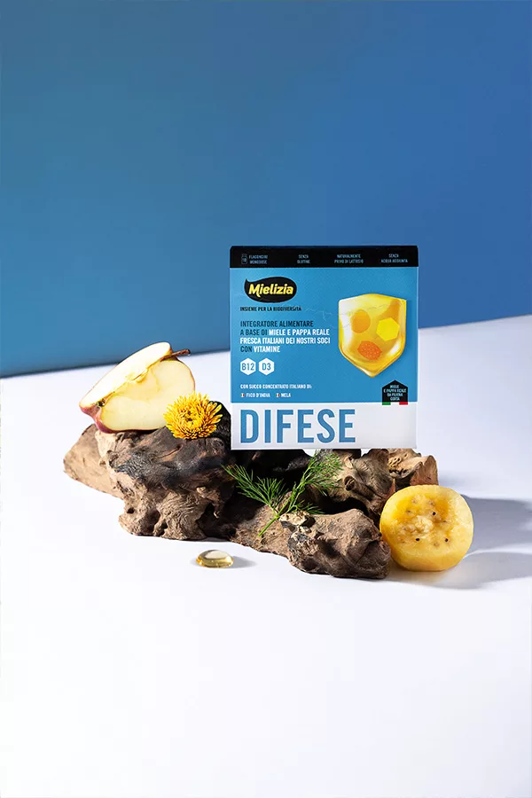
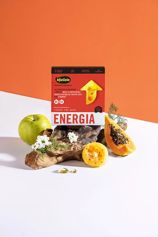
To maintain consistency with Mielizia’s brand identity, the packaging design leverages the use of solid, saturated, and vibrant colors, which help the user in identifying the product on the shelf, while simultaneously describing the product’s benefit.
The color is not just an aesthetic device but defines a code that clearly conveys the product’s benefit.
In addition to color, large icons are used to metaphorically represent the benefits of the supplement. The icons have a textured, three-dimensional appearance that emulates honey. Inside them, the main ingredients of which the supplement is composed are iconized.
The hierarchy of information places the primary element, the benefit of the supplement, at the bottom, created with a bold typography that matches the color of the pack and stands out thanks to the strong contrast with the white background. At the top of the pack, a black band is used to recall Mielizia’s brand identity and highlight the technical information of the product.
The result is a packaging line with a strong visual impact and immediate legibility, ideal for the shelves of large-scale distribution.
The products are well-recognizable and clearly described, with a combination of color, fonts, and icons that facilitate the consumer’s reading and choice.
Supporting the color, large icons are used, which through metaphors, describe the benefits of the supplement. The icons feature a material appearance, three-dimensional, and they emulate honey. Inside them, key ingredients of the supplement are iconically represented.
The information hierarchy places the key benefit of the supplement prominently at the bottom with bold typography that matches the pack’s color, standing out against the white background. At the top of the pack, a black strip is used to accentuate Mielizia’s brand identity and highlight key product details.
The outcome is a packaging line with a strong visual impact and easy readability, ideal for large-scale grocery shelves.
The products are highly recognizable and well-described, using color, font, and icons that simplify decision-making for the consumer.
