Nomadic Roots Nutrition: 360° branding for the taste nomad startup
Reduction | Design | Branding | Startup
Challenge
Design the brand identity, packaging and website for the American startup Nomadic Roots Nutrition.
Result
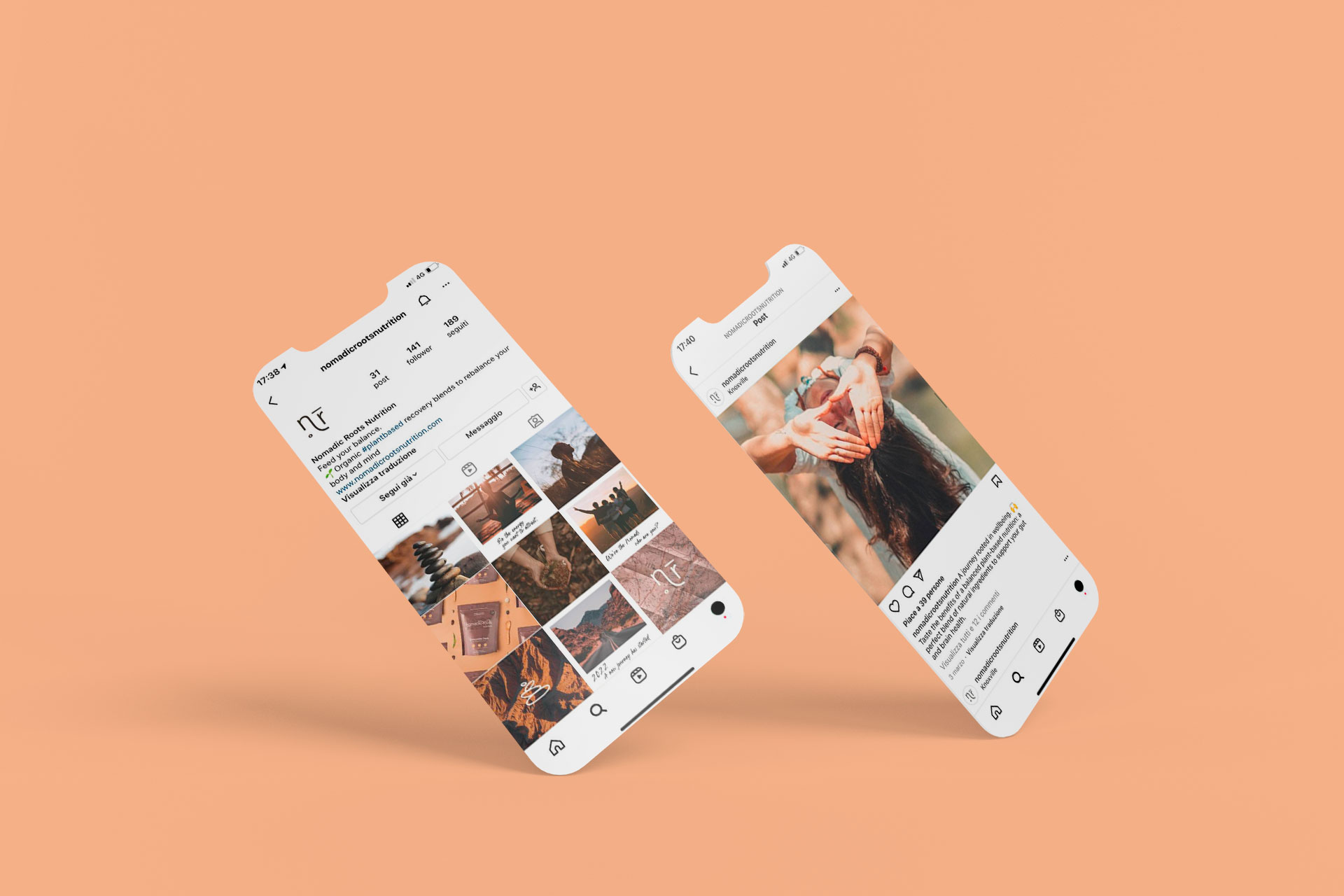
New coordinated image for the recovery-blends startup Nomadic Roots Nutrition, including brand identity, packaging, website, and social media management.
Client
Nomadic Roots Nutrition
SDGs
The development of the new brand identity first saw HENRY & CO. sit down with Nomadic Roots Nutrition to better understand, through Circular Design Thinking sessions, the values and ambitions of the startup. Based on what emerged, HENRY & CO. then shifted its focus on identifying the target audience, building Personas to archetype the target group, and conducting a competitor analysis.
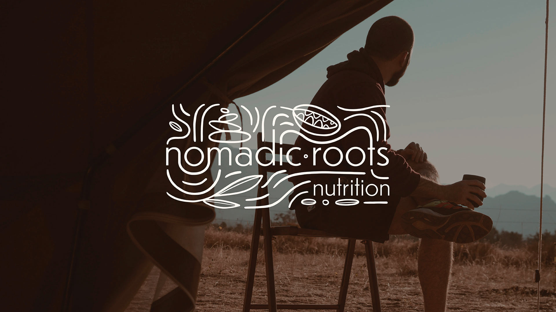
Only once these fundamental insights were gathered did HENRY & CO. begin to explore sensations, imagery, and graphic elements that could speak to the target. Simplicity, genuineness, naturalness, travel, exploration, and discovery were the concepts that guided the design of the new identity.
The result is an organic blend of vector and freehand: small illustrated elements describe and enrich the graphic content, mainly consisting of roots that emerge, intertwine, and surround the logotype.
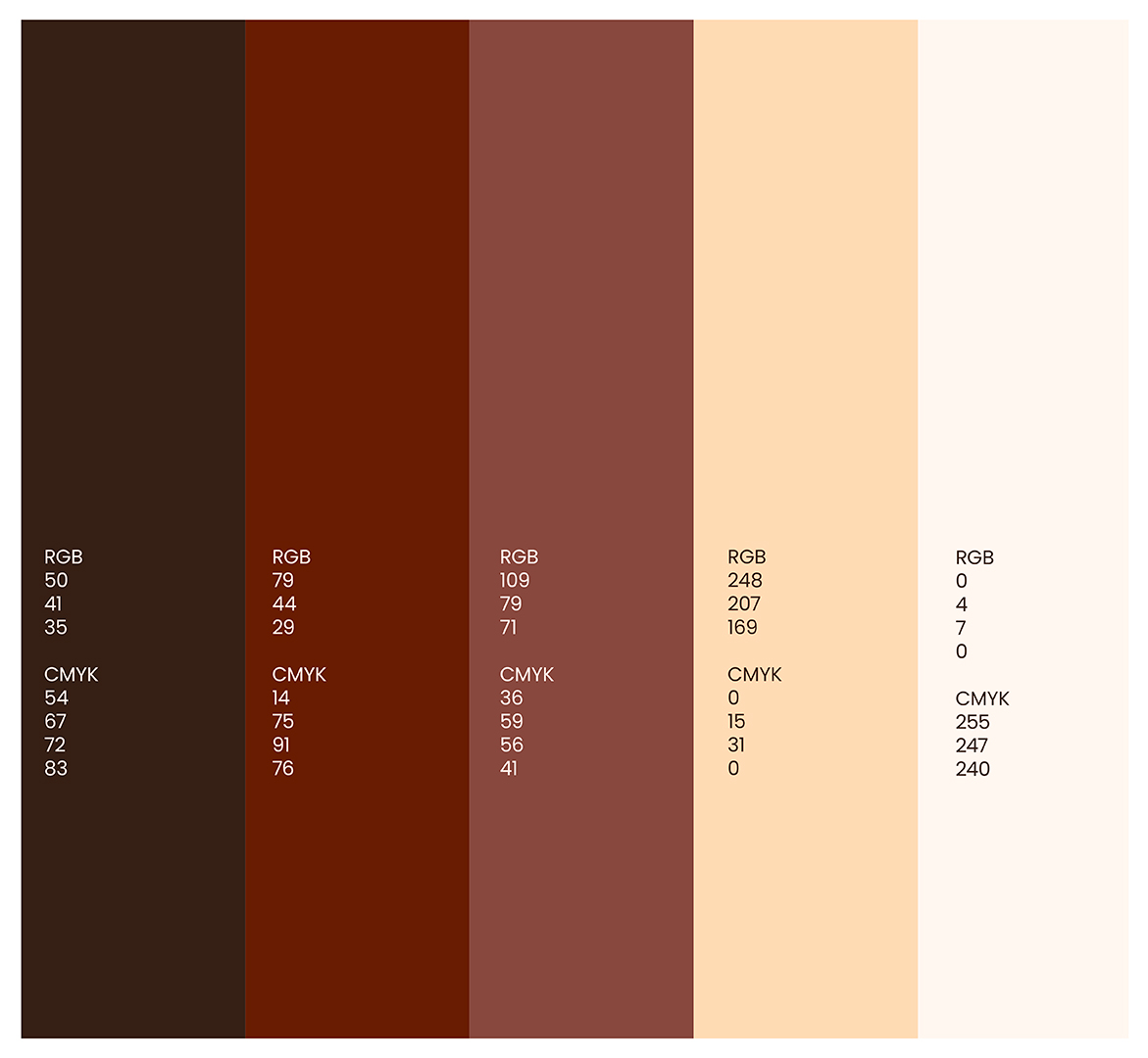
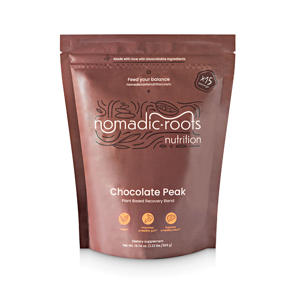
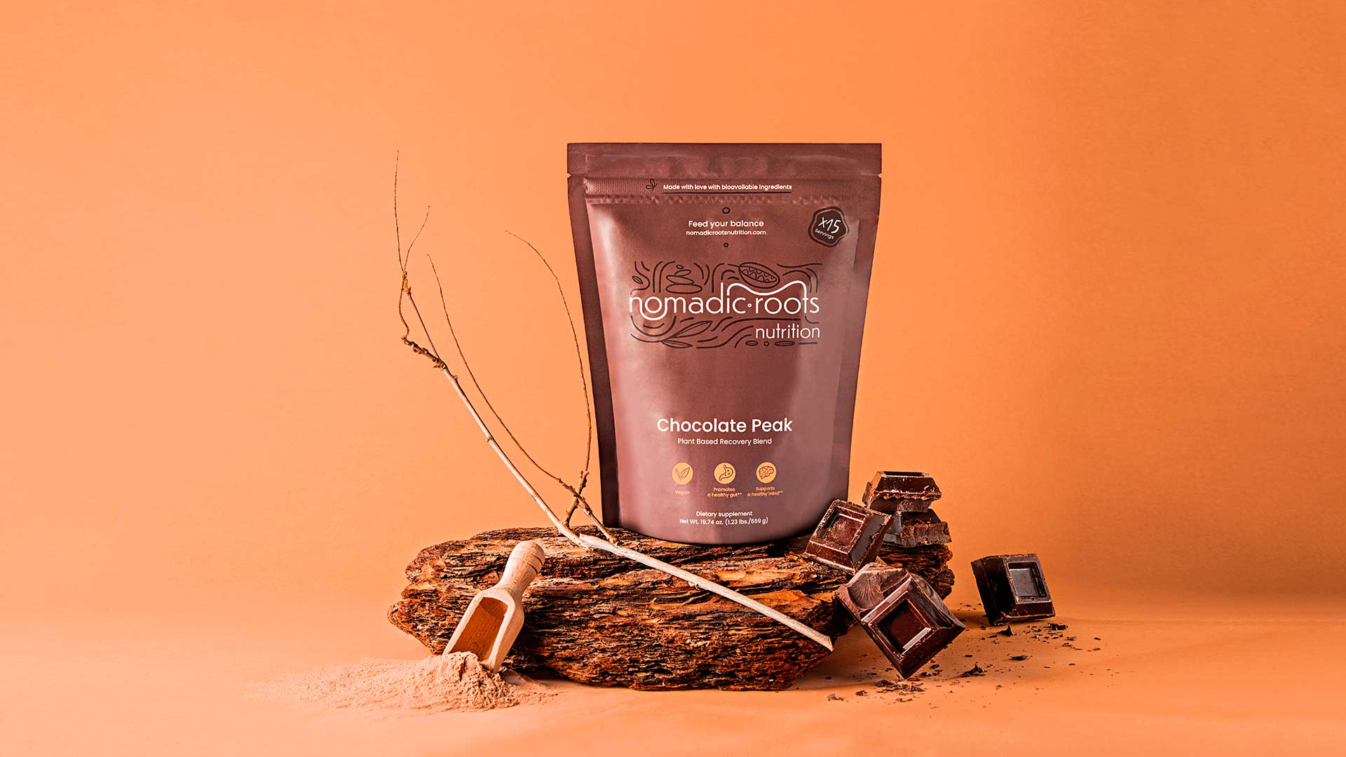
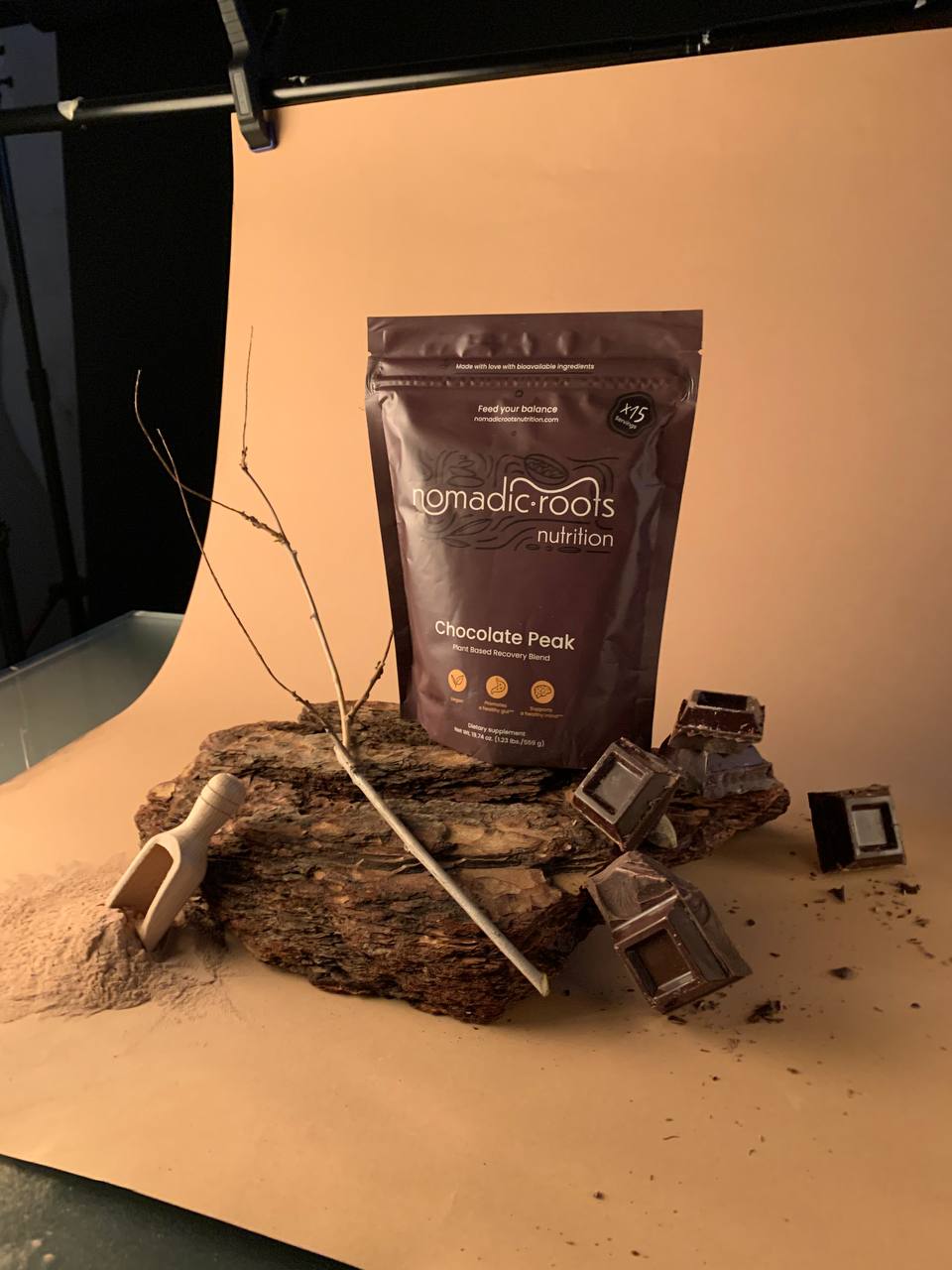
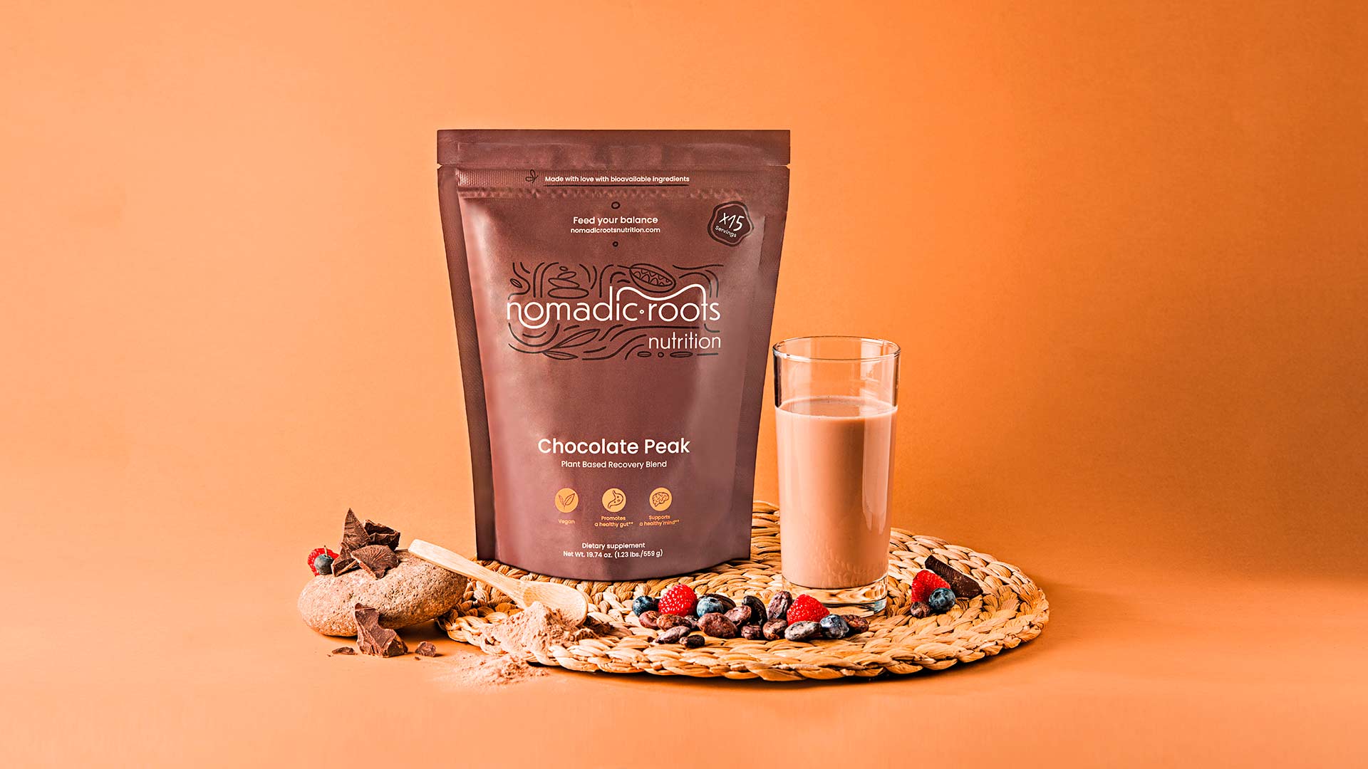
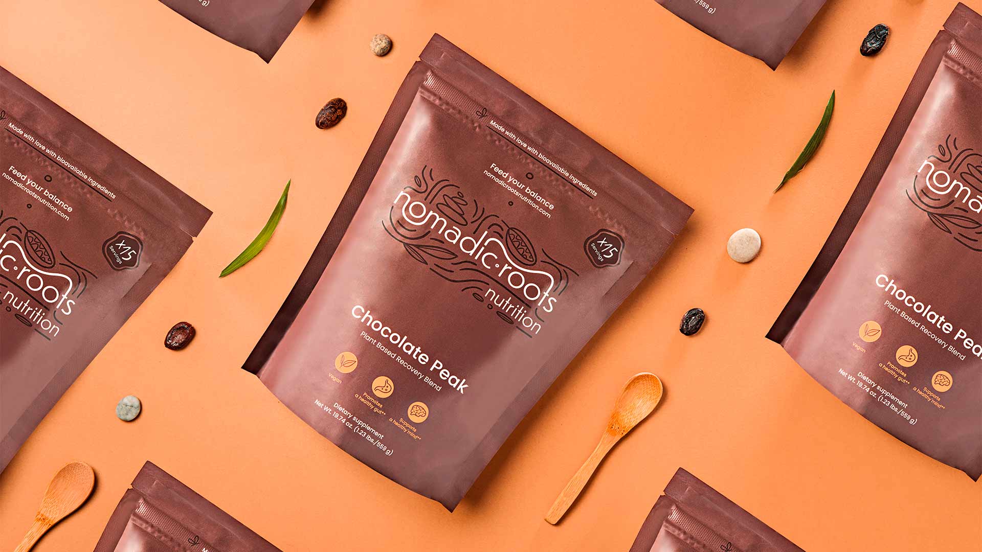
The product packaging is one of the most crucial touchpoints in this case: as the content is amorphous (powder), the packaging gives the product shape and color. In continuity with the tones and hues established for the brand identity, the packaging takes on the colors of cocoa, reflecting the taste of the product while evoking imagery of naturalness, genuineness, and simplicity.
In addition to the logo, which takes center stage on the front of the package, the product name and a few essential features are highlighted, leaving room for clean design and the depth of color.
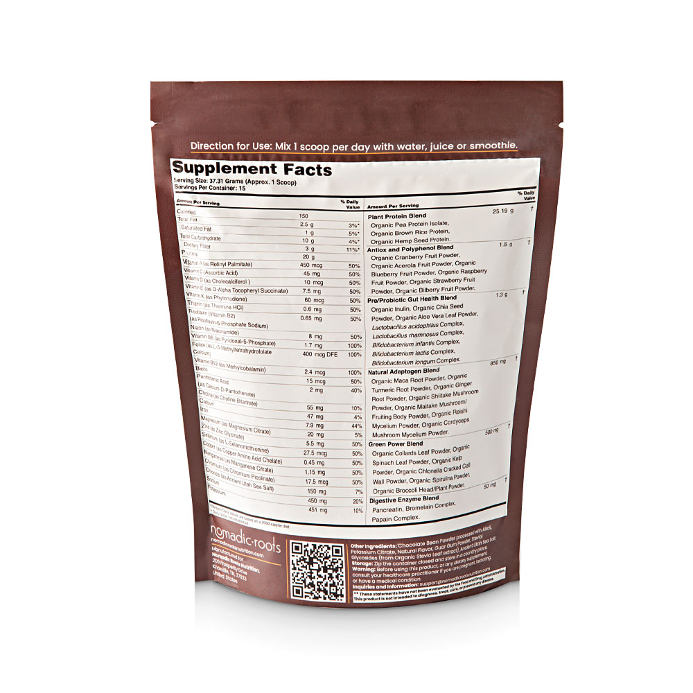
The pouch, made of polyethylene (necessary for product preservation), is easily recyclable and contains 20% post-consumer material.
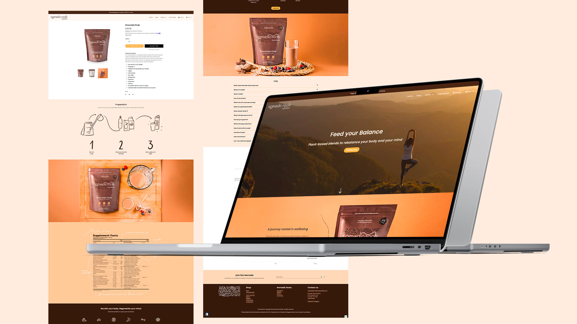
The website design followed the style set by the brand identity, with the warm tones of the earth, simple and direct language, space, cleanliness, balance. The result is a simple and intuitive website, strongly focused on transparency and information, deepening every ingredient, content, and benefit of the product to provide a streamlined and immediate shopping experience.

